Stationery Product Photography: Paper, Print, and What’s Included
Plan useful photos of greeting cards, notebooks, and stationery sets. Show covers, interiors, and edges without treating a photograph as proof of page count, exact dimensions, or included accessories.
·
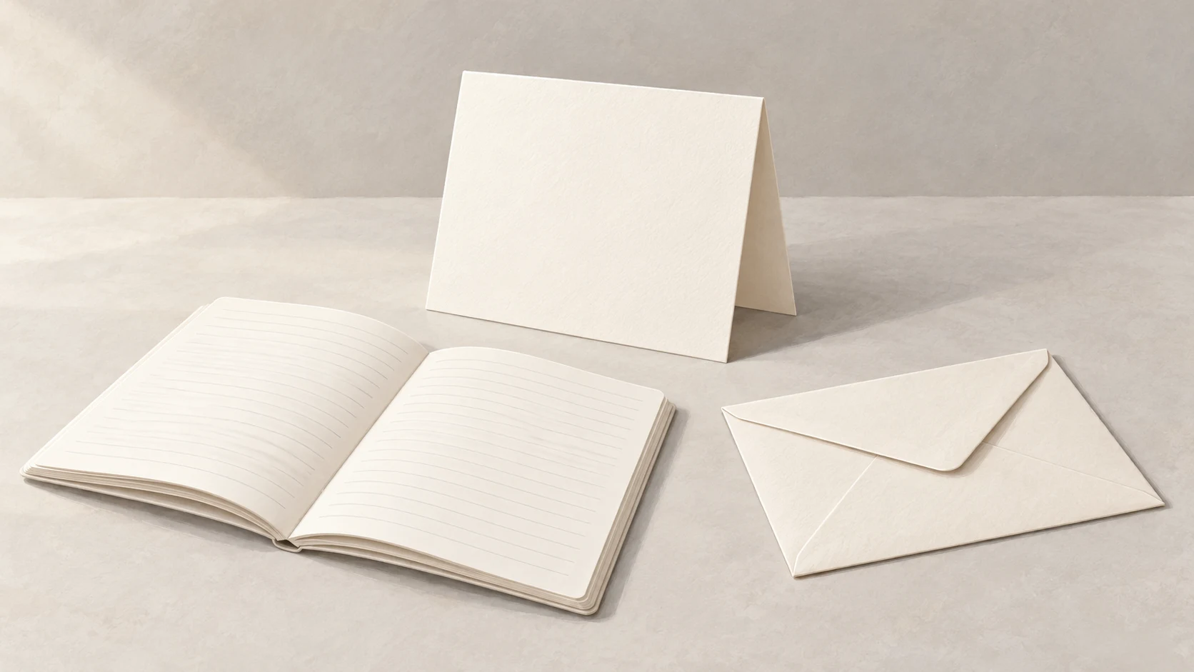
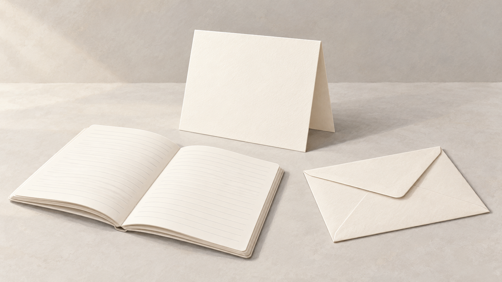
A lovely overhead photograph can show a stationery design without answering the questions a buyer actually has. Is the card blank inside? Does the notebook have lined or plain pages? Are the envelope and pen included?
Stationery product photography works better when each image answers a specific question instead of making one styled scene carry the whole listing. The following is a suggested shooting method, not a tested case study. Use the actual product you intend to sell.
Greeting cards: show what happens when they open
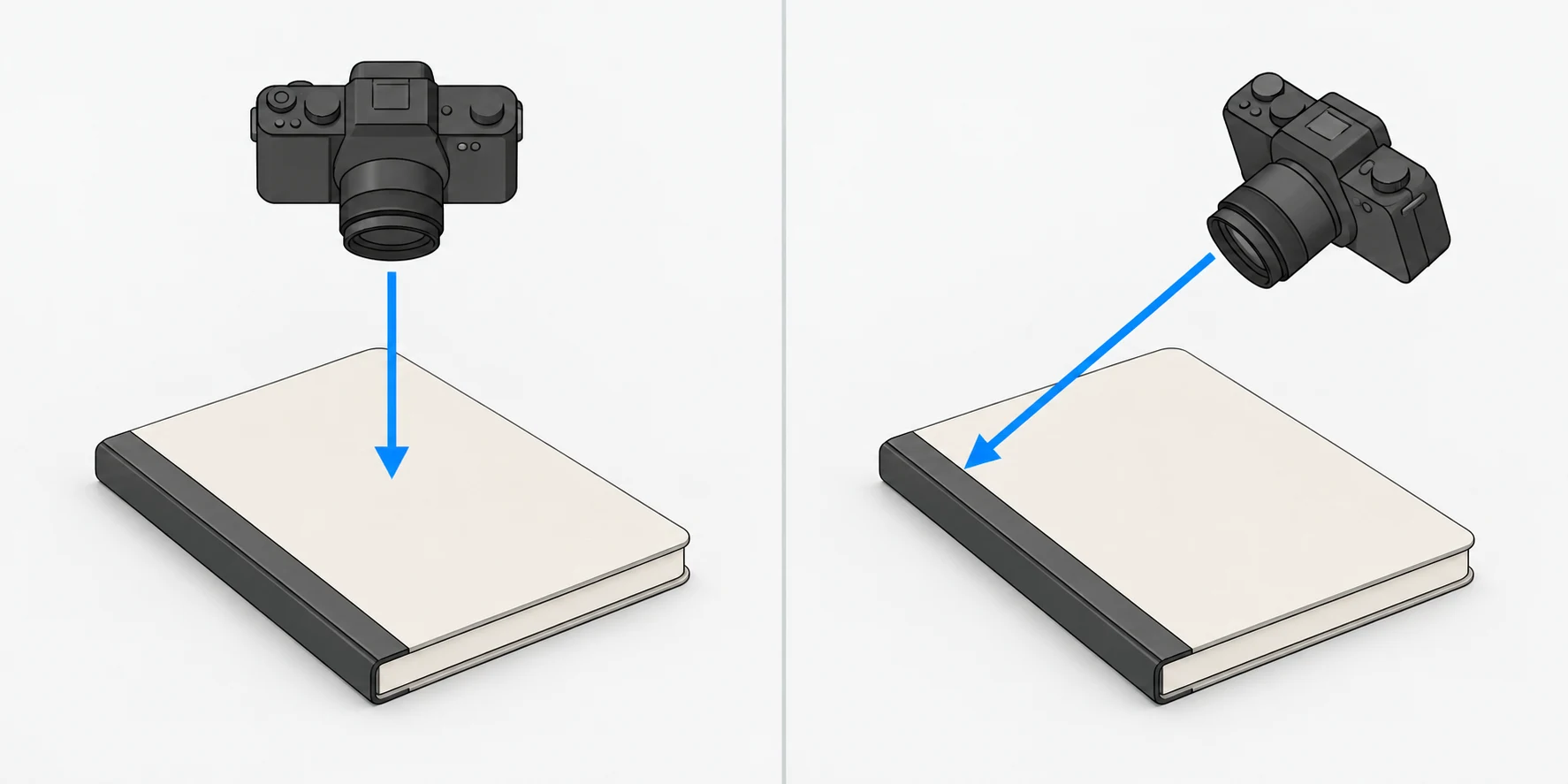
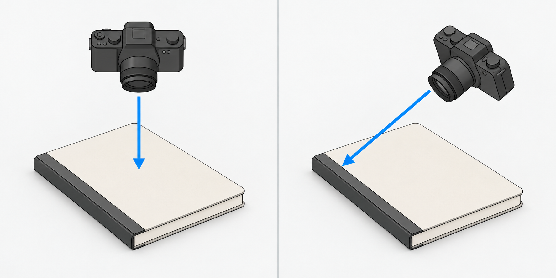
Start with an unobstructed front view so the design and printed wording are readable. Keep the camera as parallel to the card as practical to reduce perspective distortion. Avoid covering the corners or small print with props.
Then photograph the open card. A blank interior is useful product information; it does not need a decorative insert to make the shot more interesting. If the back has branding or other printing, show it separately rather than expecting buyers to infer it from the front.
Add an angled detail of an edge or fold. Try light coming across the surface to reveal embossing, texture, or the paper edge. For foil or glossy printing, adjust the relationship between the product and the light until you can distinguish the reflective finish from the lettering. An angled photograph can describe a surface, but it cannot establish exact paper weight, thickness, or dimensions. Use checked specifications or measurements for those claims.
Notebooks: an interior photo is not a page count
Keep a closed-cover view, an open interior view, and a close-up of the binding or page block. The interior image should make the ruling legible: lines, squares, dots, or a blank surface. If the notebook contains different page layouts, show the relevant differences rather than selecting only the most attractive spread.
Do not force the binding flat for the photograph. Work with its normal opening angle and keep the important layout visible. An oblique view of the page block helps communicate bulk, but it does not verify the number of pages.
Check the count against the physical product, packaging, or reliable product documentation. State the counting convention clearly: one leaf has two sides, so “leaves” and “pages” are not interchangeable. Whether blanks and introductory pages are included should match the listing. Keep files associated with their exact variant so a thicker notebook does not inadvertently illustrate a thinner one.
For scale, consider a separate reference photograph with a ruler, alongside checked written dimensions. An angled view or a familiar prop offers context, not an exact measurement.
Sets: establish the contents before styling the scene
Make one photograph containing only the items actually sold together. Separate small pieces that would otherwise overlap. Before shooting, write down the names and quantities for that variant, then check each item as you place it. Confirm whether the packaging is included. Build this record from the product or reliable documentation, not from an edited image.
A separate lifestyle image can include a pen, flowers, or clips, but explain nearby which items are props. A pen placed in a pen loop or an envelope tucked under a card can imply inclusion even when the seller intended it only as decoration.
The contents image and the styled image serve different purposes. This is not a clothing-flat-lay arrangement exercise: readable print, visible interiors, and unambiguous quantities matter more than repeating a decorative layout.
Paper color and texture may need different views
The Cultivated Creative’s stationery photography article recommends natural light while avoiding direct light and overhead lighting. Treat that as a starting point, not a universal exposure recipe.
Try soft, even light for paper color and printed detail, then a separate side-lit view for texture. Do not turn cream paper white while brightening the background. Excessively bright highlights can also make pale printing difficult to see. A neutral reference card in a test frame can help you check capture-related color casts; keep white balance consistent within the set. It cannot remove differences between viewers’ screens.
Use overhead views to explain the flat design and arrangement, and angled views to add information about folds, edges, and binding. These views complement each other. Not every product needs an identical number of photographs.
Edit the photograph without changing the evidence
Keep the originals before cleaning up background marks or adjusting composition. If you need to continue editing an existing photograph, the InkRoom image editor accepts an image and an editing description. Available models and parameters depend on the current interface; unchanged subjects, text, and structure are not guaranteed.
Describe the intended edit narrowly—for example, a mark on the background or extra space around the frame. A narrow request is not a fidelity guarantee. Compare the result with both the original and the product. Reject images that rewrite printing, invent pages, alter corners, or add accessories. If essential product information cannot be retained reliably, reshoot it.
Use the export review below rather than adding a second, duplicate checklist.
| What to check | Compare against | Changes to reject |
|---|---|---|
| Printed wording | Enlarged original and export; check names, dates, branding, and punctuation | Misspellings, broken strokes, substituted lettering, or invented text |
| Paper color and detail | Product and capture reference; inspect pale print, texture, and highlights | Cream paper turned white or faint details lost |
| Crop and edges | The final display crop, including cover, corners, and binding | Missing identifying edges or altered apparent thickness |
| Page count and variant | The checked product record, not an inference from the photo | Variant mismatches or page counts inferred from bulk |
| Set contents and props | The verified contents record and nearby scene description | Added accessories, missing pieces, or props implied to be included |
Let photographs show what the product looks like, and let checked specifications explain what the photographs cannot prove. A simple image does not have to mean an incomplete listing.
Related articles and cases
- Hand Model Product Photography: Natural Grips, Credible Contact
Plan small-product shots around visible details, believable support and useful scale cues. Learn what to check in a real photograph or an AI composition sketch without treating either a hand or a generated image as measurement evidence.
- Plant Product Photography: Show Shape, Leaf Condition and Pot Size
Photograph live plants so buyers can understand their current shape, leaf condition and size. Build a useful shot list, identify individual or batch photos, and check that edits still match the plant for sale.
- Wine bottle photography: readable labels, clear shoulders, honest fill levels
Make wine product photographs that identify what is actually for sale. Separate catalog images from lifestyle scenes, work around label reflections, and check product details after editing.
- Product Photography Props: Make the Product Clear, Not the Offer Confusing
Choose props for support, use context, or decoration. Compare a clean product shot with a lightly styled version, then check visibility, reflections, color competition, and what buyers might think is included.