AI Website Hero Image Generator: From Brand Brief to Responsive Crops
Turn a brand brief into a useful hero image, then check what survives on desktop and mobile. Includes a prompt example, a reproducible crop calculation, and practical checks for readability, loading, and truthful product representation.
·
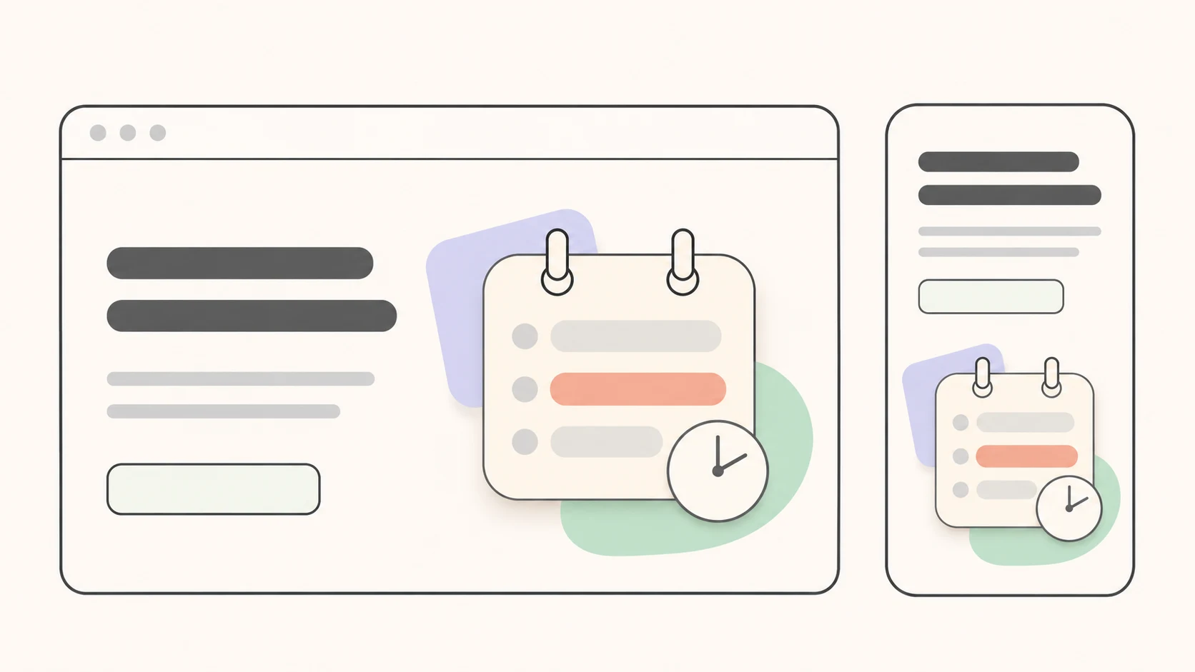
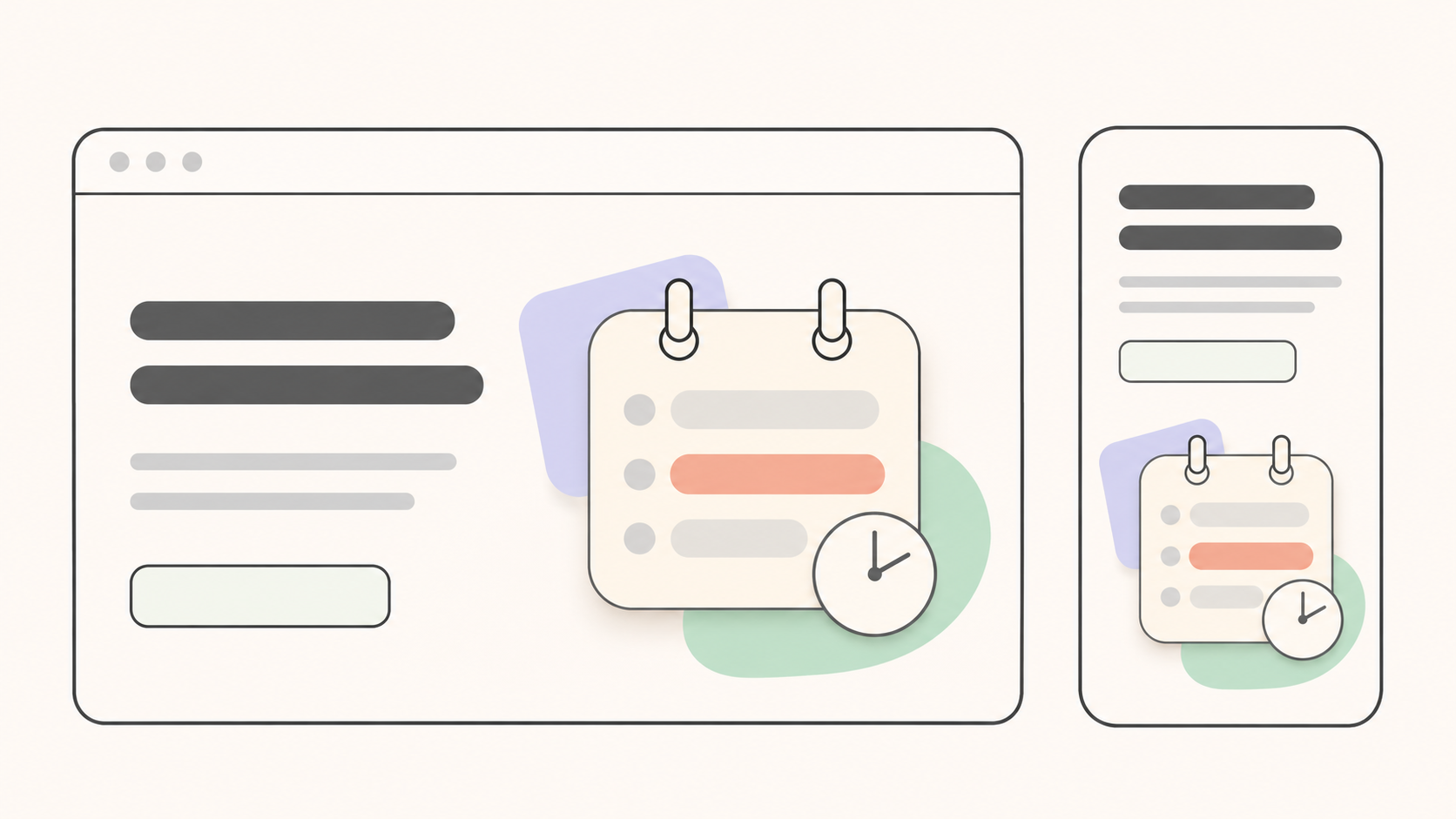
A hero image needs to work with the headline: what is this, who is it for, and what can the visitor do next? When using an AI website hero image generator, answering those questions is more useful than choosing a visual style first.
The generator can help create candidates. Whether a candidate belongs on the page is a separate decision. Screenhance’s hero image guide likewise emphasizes connecting the headline with the visual and checking mobile readability and loading performance. A composition alone does not guarantee a conversion lift.
Decide what the image needs to explain
Imagine a landing page for an appointment-booking service with the headline “Let clients choose their own appointment time.” This is an illustrative scenario, not a tested customer case.
If the hero needs to show how booking works, start with an authorized screenshot of the actual, current product. AI can help create a background or supporting visual, but it should not invent a convincing calendar interface with features the service does not have. If the image only needs to convey a calm, organized atmosphere, a conceptual illustration may be appropriate. Do not present it as a real location, customer, or service session.
Before writing the prompt, reduce the brand brief to a visual assignment:
- Audience and message: Who is arriving, and what should they understand after reading the headline?
- Subject and evidence: What must be represented accurately, and what can be decorative?
- Layout and space: Where will the desktop headline and button sit? On mobile, will text overlap the image or sit above it?
Brand colors help the image fit the page; they do not answer those questions. Keep essential headlines, prices, and buttons out of the generated artwork. Separate page text is easier to revise, wrap, and localize.
Describe the page arrangement in the prompt
A useful prompt explains the image’s job rather than relying on adjectives such as “premium” or “stunning.” For an atmospheric illustration, a brief could read:
> Create a conceptual illustration for an appointment-booking landing page aimed at independent service providers. Convey calm, organized scheduling. Place the main subject on the right and leave a large, low-detail area on the left for a separately rendered website headline and button. Use the supplied brand palette. Do not generate text, logos, testimonials, or a product interface. The mobile layout will put text above the image; use a clear subject silhouette and do not depend on small objects near the edges to communicate the idea.
This is a suggested creative brief, not a validated universal prompt. Inspect the output: describing empty space or a subject position does not prove the result contains it.
Once the brief is ready, you can enter it in InkRoom’s image generation page and choose from the configured models. Availability, settings, and fees depend on the current interface and account configuration. Compare candidates for how well they support the message before refining their style.
Calculate what a mobile crop actually keeps
A smaller desktop image is not necessarily a mobile-ready image. Scaling and cropping do different things, and filling a differently shaped container can remove much of the composition.
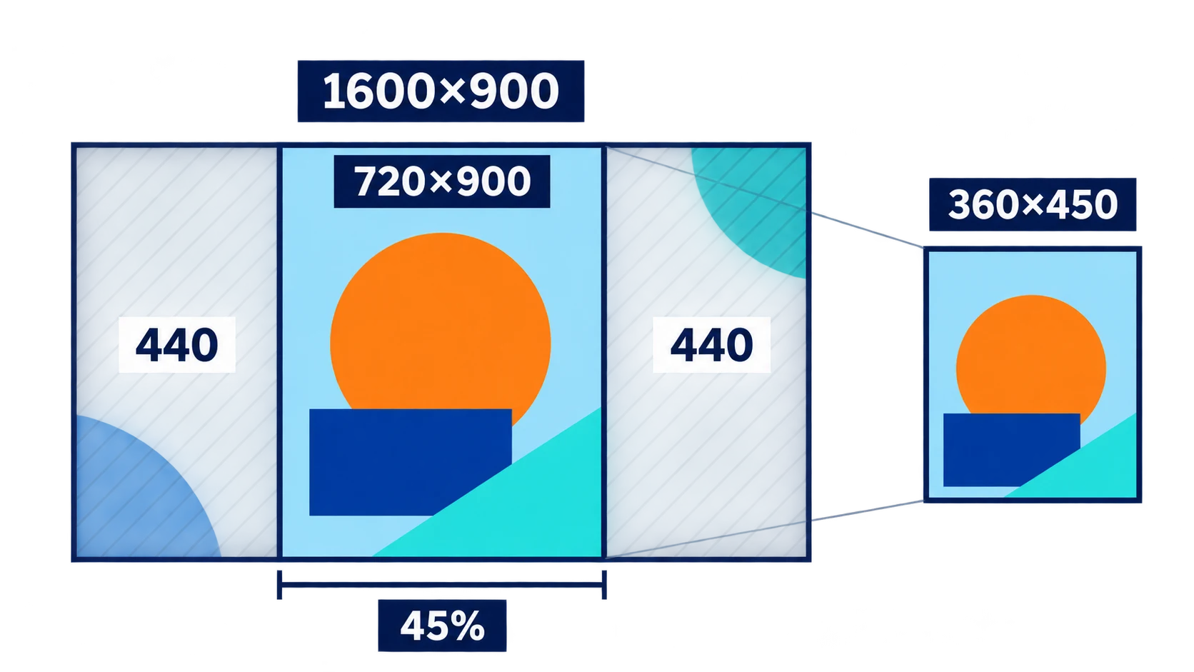
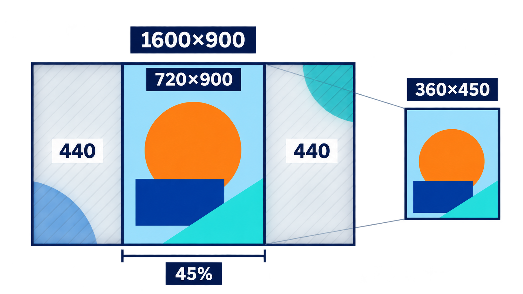
Consider a 1600 × 900 source image placed in a 360 × 450 mobile image container using proportional fill and a centered crop. These are illustrative dimensions, not recommended sizes or a claim about any tool’s exports.
The required scale is:
max(360/1600, 450/900) = 0.5
The scaled image measures 800 × 450, but the container shows only 360 × 450. In source-image coordinates, the visible area is the central 720 × 900: just 45% of the original width, approximately from x = 440 to x = 1160.
A right-aligned subject may disappear. So may the empty area intended for a headline. Choose the remedy based on what is being lost:
| What goes wrong | Possible adjustment | What to verify afterward |
|---|---|---|
| The subject fits but sits in the wrong place | Change the focal position or crop alignment | Another essential element has not been cut off |
| The subject and text space cannot both survive | Move mobile text outside the image, or create another composition | Headline wrapping and button placement still work |
| A real product screenshot becomes illegible | Use a relevant detail from the actual interface | Removing context has not misrepresented the workflow |
| The source lacks usable background space | Revise the existing image or create another background | Added material does not change the meaning of the product or person |
If an existing image needs further work, consult InkRoom’s image editing page and confirm the available operations in the current interface. This is not a claim of automatic responsive cropping, breakpoint adaptation, or compression.
Check the result inside the actual page with its real headline and button, not just in an image preview. Inspect widths around layout changes as well as desktop and mobile endpoints: an intermediate width can expose a problem neither endpoint reveals.
Make the publishing decision on the page
Check text against the difficult parts of the background. Low-detail space does not necessarily provide sufficient contrast. Test the actual headline, body text, and button colors with a contrast-checking tool. If the background varies substantially, change the composition, add a stable backing behind text, or move the text outside the image. Sampling only the cleanest patch is not enough.
Compare actual files, not format labels. Export candidates at the intended display dimensions with different formats and quality settings. Record their byte sizes and inspect edges, gradients, and subject detail, then check loading in the page. A WebP label alone does not prove a file is smaller. Higher resolution is not automatically better either; weigh clarity against transfer size.
Match visual claims to real evidence and permissions. Review product appearance, interface details, people, and locations for anything visitors could mistake for factual proof. Establish the source and permitted use of uploaded screenshots, reference photos, logos, and images of people. A generation service’s terms do not replace checking rights to third-party material. Resolve uncertain material before public use.
Keep the source assets, brief, selected version, and crop notes for future revisions. The useful hero is not necessarily the most elaborate image on its own. It is the one that still explains the page, accommodates its text, and avoids promises the product cannot support.
Related articles and cases
- AI Sketch to Render: Keep Architectural Intent in the Picture
Turn an architectural sketch into a useful concept rendering by separating design constraints from visual choices. Learn how to prepare inputs, compare directions, review geometric drift, and define the limits of image and API handoffs.
- AI Garden Design Generator: Explore Layouts, Then Check Growing Conditions
Turn a yard photo into a clearer design brief, explore layout separately from seasonal color, and check promising ideas against site measurements and local plant information.
- AI Furniture Design Generator: From Style Sketches to Dimension and Material Checks
Use a hypothetical entryway storage bench to explore furniture concepts, identify contradictions between views, and separate visual decisions from dimensions, materials, and construction that need independent validation.
- AI Jewelry Design Generator: From Ring Concepts to Manufacturability Review
Turn ring ideas into concepts you can meaningfully compare, without mistaking a convincing image for engineering evidence. Learn what to record, what different views can reveal, and what to ask a jewelry professional to verify.