AI Typography Generator: From Lettering Concepts to Usable Deliverables
Decide whether you need a poster image, brand lettering, or an installable font. Then prepare exact text, inspect readability, and verify language coverage, file compatibility, and licensing separately.
·
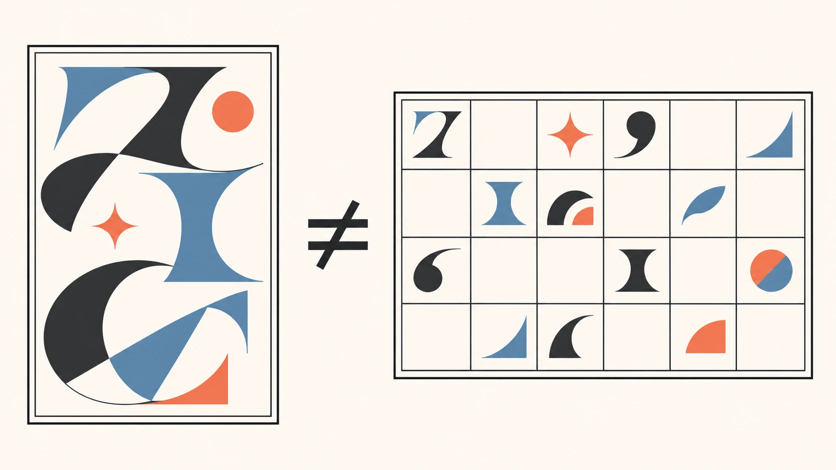
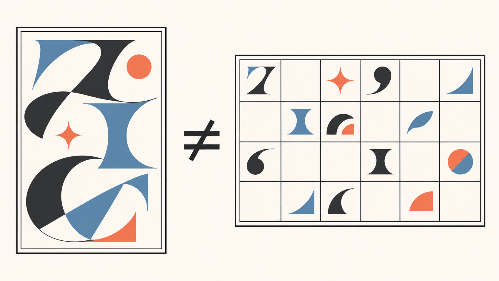
A striking title image may not let you change next month's headline. A handful of impressive letters does not establish that a complete typeface exists. Before choosing an ai typography generator, ask: will you need to change the words after delivery?
For fixed text, an image mockup can help explore a poster treatment. If the same style must support changing headlines, generating one image is only part of the job. You also need to establish how the text will be reset and which editable assets will be delivered.
An image, reusable lettering, or a font?
| Intended use | Deliverable to specify | What a good-looking sample does not establish |
|---|---|---|
| One poster treatment | An image containing the final text at the intended dimensions | Consistent results when the words change |
| Brand lettering | The fixed wordmark and agreed editable files; font development is a separate decision | That a wordmark constitutes a complete typeface |
| An installable font | An actual font file with the required character coverage | That an image or vector outlines can be installed as a font |
Resolve this with your collaborator before choosing between “retro” and “futuristic.” It separates visual exploration from the typesetting or font-development work still needed.
Start with exact text, then describe the style
Prepare a text master containing the full headline, capitalization, punctuation, numerals, and accurate wording for every language version. For a reusable headline system, include real short and long headlines and the characters you expect to use—not just a few attractive letters.
Then describe the visual direction and context. This is a suggested input, not a tested recipe:
> Explore a lettering direction for an event poster. Exact text: “OPEN STUDIO 2027,” using uppercase English letters and numerals. Aim for broad letterforms and clear strokes on a simple background so the characters and spacing are easy to inspect. Show a front-facing lettering concept without perspective, occlusion, or additional copy.
Reducing distractions makes errors easier to spot; it does not guarantee accurate text generation. Explore materials, lighting, and backgrounds after inspecting the basic forms. If decoration obscures a stroke, return to a simpler version.
For this visual-concept stage, the InkRoom image-generation entry lets you enter a prompt and choose from configured models. Availability, parameters, and fees depend on the current interface and account configuration. This is an image-mockup workflow, not a claim of installable font export, font identification, or licensing review.
Read the lettering before judging the style
Place the text master beside the sample and compare every character. Do not approve it because the sentence looks roughly right. Look for omissions, repeated letters, punctuation changes, capitalization errors, and decoration that makes one character resemble another. For Chinese, Japanese, and Korean text, also inspect missing, merged, or distorted strokes and components.
Next, place the sample in its intended layout and inspect it at the target display size. Fine lines that look clear when enlarged may become hard to read when reduced. A different background can also weaken the distinction between lettering and its surroundings. Adjust the forms, spacing, size, or background before adding more effects.
If the deliverable is meant to support reusable headlines, substitute another real headline. Check whether different lengths still work with the spacing, line breaks, and layout. This tests the design's reusability; it does not imply that an image-generation entry provides editable text.
Verify languages and rights against the actual asset
Do not infer multilingual support from an English sample. In the supplied body text, the Font AI reference page says it currently supports only English while planning support for other languages. The page has no clear update date, so treat this as a statement in the source—not a verified current capability list, and not a statement about InkRoom.
For a font deliverable, obtain the actual file and type the required text in the intended application. Watch for missing characters and font substitution: a visible character may be supplied by a fallback font rather than the font under inspection. Choose formats according to the receiving application's requirements, not the filename extension alone.
Check licensing independently. Keep the source, license text, version, and acquisition date, then examine the intended use: poster artwork, handing files to a client, modifying letterforms, web embedding, and redistribution can involve different conditions. A reference site's general licensing or ownership statement does not replace the license accompanying your asset, nor does it guarantee trademark registration.
At handoff, distinguish confirmed properties from unresolved ones. An image can be delivered as a visual direction. Without the font file, character checks, and licensing evidence, do not label it a completed commercial-use font.
Related articles and cases
- AI Children’s Book Illustration Generator: From Storyboard to Consistent Pages
Plan interior illustrations around story changes, not isolated images. A fictional example shows how to track characters and props, reserve room for text, and distinguish illustration drafts from a finished book.
- AI Fashion Design Generator: From Silhouette Concepts to Sample Review
Turn audience, silhouette, fabric appearance, function, and cost constraints into fashion concepts—then separate visual decisions from the pattern, material, sizing, and sample checks needed for production.
- AI Generated Images Copyright: US and UK Checks and Creator Records
Separate permission to use an image, copyright protection and third-party rights, then document asset licences, tool terms and human edits. The current US and UK rules still require verification against the specified official texts; this draft is not ready for publication.
- AI Map Generator: From Worldbuilding Notes to a Usable Fantasy Map Draft
A fantasy map needs more than convincing mountains and rivers. Use a fictional river-crossing scenario to turn worldbuilding notes into visual constraints, then check names, routes, distances, and what players should see.