AI T-Shirt Design: From a Standalone Graphic to a Garment Mockup
Define the audience, print placement, garment colors, and palette before generating a graphic. Then compare light and dark mockups, check physical print dimensions, and separate a convincing preview from a production file.
·
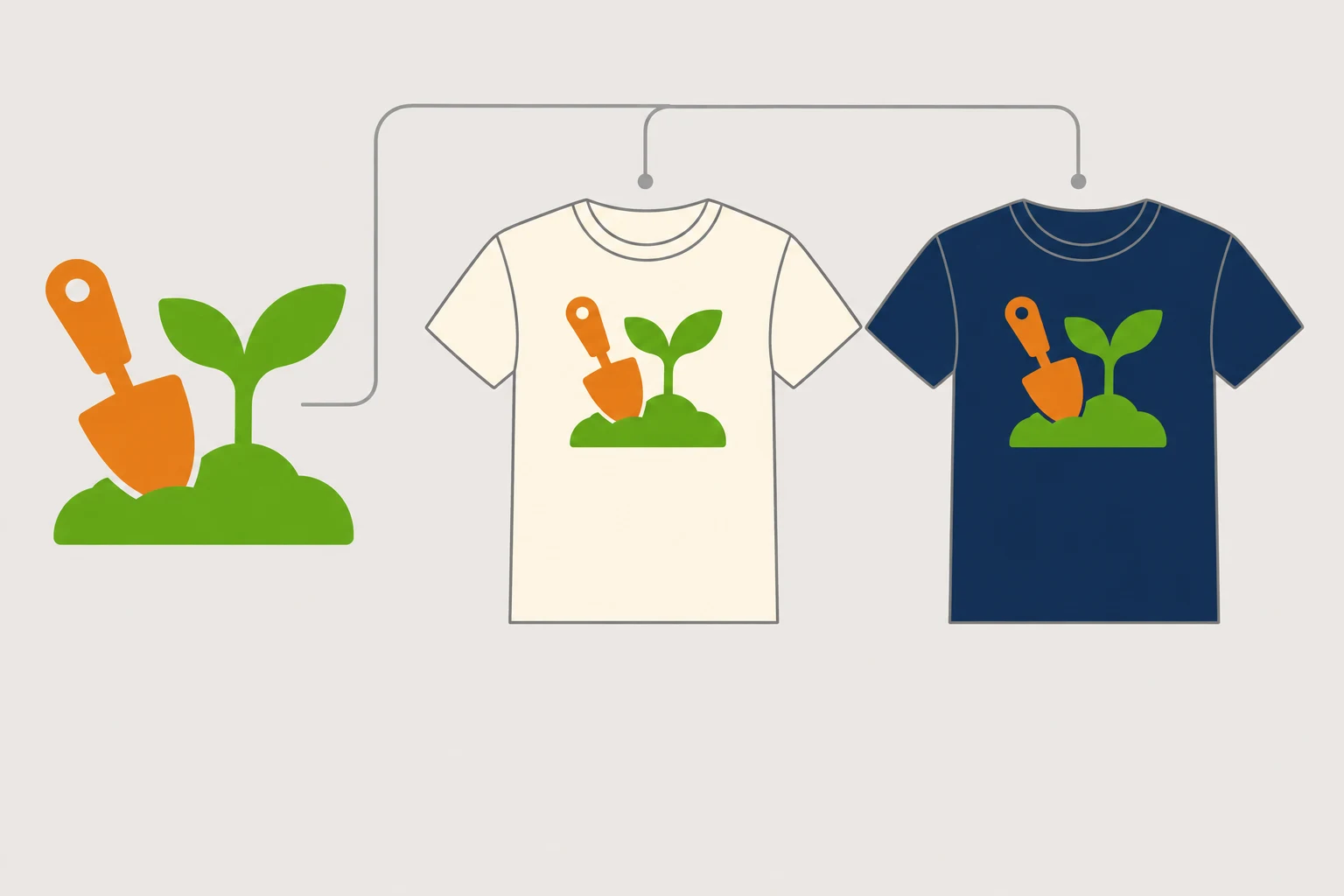
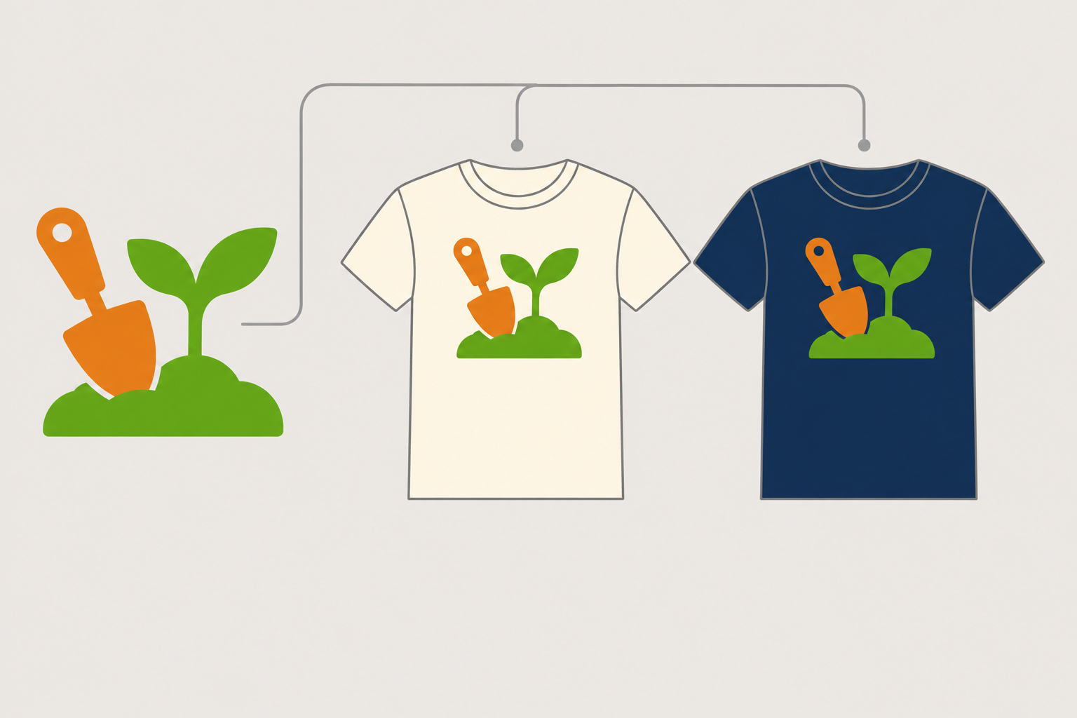
A graphic can look convincing on screen and still be difficult to read on a T-shirt. Fine lines may disappear at a small chest placement. A clear outline on white may blend into a dark garment.
When using an ai t shirt design generator, start with who will wear the shirt, where the graphic will sit, and which garment colors it needs to work on. The community-gardening example below is a hypothetical design brief, not a generation or print test.
Ask for the graphic, not just a picture of a shirt
The LightX T-shirt design page recommends describing imagery and colors in a prompt. It also presents garment mockups as a separate option. These serve different purposes: a standalone graphic lets you discuss the artwork, while a mockup helps you judge its relationship to the garment.
For an initial print concept, specify “standalone artwork, no shirt, model, or photographic scene.” This keeps the discussion focused on the design. It does not guarantee a transparent background, vector artwork, or a production-ready file.
Suppose you are designing shirts for adults attending a weekend community-gardening event. The graphic will sit on the front chest, the shirts will be cream or navy, and the visual palette is limited to two colors. A trowel and seedling could communicate the theme through broad shapes rather than intricate leaf veins.
A two-color visual brief is not the same as a file separated into two printable inks. Gradients, shadows, and partially transparent edge pixels still need inspection.
Turn those decisions into a usable prompt
Here is a suggested starting point, not a tested recipe:
> Create a standalone chest graphic for a community-gardening T-shirt. Combine a garden trowel and a seedling in a compact composition, using clear large shapes and substantial outlines. Limit the visual palette to grass green and warm orange; avoid gradients and intricate texture. Consider use on both cream and navy garments. Do not include a shirt, model, photographic setting, brand logo, or lettering. Keep the boundary between the subject and background clear for later inspection.
Mentioning both garment colors describes the intended use; it does not guarantee two correctly adapted outputs. If the event name is essential, consider setting it separately with a font whose license covers the intended use. Check every character. Generated lettering can also be explored, but an attractive composition is not proof of accurate spelling.
To explore the concept, enter your brief in InkRoom’s image-generation page and select a model configured in the current interface. Availability, settings, and fees depend on the interface and account configuration. This is an entry point for concept generation—not evidence of mockup, color-separation, or print-delivery capabilities.
Change the garment color without changing everything else
Keep the graphic version, intended print width, and placement relative to the collar consistent when comparing light and dark garments. If you change the artwork, scale, and position together, the cause of a difference becomes harder to identify.
A front-facing preview with few folds is useful for judging layout. Other views can help you consider how the shirt may look when worn, but mockup perspective and fabric folds do not replace a flat dimensional check.
| What to inspect | What to look for on light and dark garments | What to revisit |
|---|---|---|
| Outlines and internal lines | Dark lines merging with dark fabric; pale details disappearing on pale fabric | Outline treatment, local colors, or detail density |
| Lettering and small shapes | Whether they remain readable at the intended chest size | Type size, spacing, wording, or graphic complexity |
| Outer edges and background | An unwanted background rectangle, pale fringe, or stray pixels | The source artwork, not just its mockup |
| Placement and space | Relationship to the collar, armholes, and shirt proportions | Position and dimensions, subject to the printer’s printable area |
Adding a white outline is not automatically the right response to poor contrast. It changes the design’s silhouette. Some printing workflows also involve a white underbase; the printer should confirm that treatment rather than having it inferred from a preview.
Translate pixels into a physical print width
For raster artwork without resampling:
Effective PPI = artwork width in pixels ÷ (print width in cm ÷ 2.54).
For example, suppose the artwork itself is 2,400 pixels wide, excluding empty margins:
| Hypothetical print width | Calculated effective PPI |
|---|---|
| 20 cm | 304.8 |
| 30 cm | 203.2 |
These are arithmetic examples, not pass thresholds for a printing process or measured sharpness results. PPI describes image pixels per physical inch; it is not the same as a printer’s DPI. Enlarging the same image does not automatically add pixels, and changing a resolution label alone does not create detail.
If the file includes substantial empty margins, calculate using the pixels occupied by the graphic. For vector artwork, check for embedded raster images and inspect strokes and lettering at the intended output size.
A mockup supports a decision; the production file needs its own review
A mockup can help you choose placement and colors. It cannot establish that the file format, color settings, edge treatment, or finest lines meet a printer’s requirements. “PNG” names a format, not a guarantee of transparency, sufficient detail, or print readiness.
Before handoff, send the printer the artwork, garment color, and intended print width. Confirm the required format, color settings, background treatment, and process-specific limits for fine lines and small text. Before a production run, consider a sample garment or proof. That is a recommended confirmation step; no completed sampling results are presented here.
Review rights separately from appearance. Check the generation tool’s applicable terms, reference-material provenance, font permissions, and any third-party logos, characters, or potentially confusing brand elements. A reference page’s “royalty-free” wording does not clear your specific design, every component within it, or InkRoom output. If the necessary evidence is missing, pause commercial handoff and investigate rather than treating “AI-generated” as permission.
Related articles and cases
- AI Map Generator: From Worldbuilding Notes to a Usable Fantasy Map Draft
A fantasy map needs more than convincing mountains and rivers. Use a fictional river-crossing scenario to turn worldbuilding notes into visual constraints, then check names, routes, distances, and what players should see.
- AI Diagram Generator: From Source Notes to Verifiable Structure
Turn source material into nodes, relationships, and traceable references before generating a diagram. A clearly fictional example shows how to preserve unknowns, review branches, and choose an editable handoff or an API workflow.
- AI Tattoo Design Generator: Turn an Idea Into an Artist Brief
Use AI to make your tattoo idea easier to discuss, not to declare it ready to tattoo. A hypothetical brief shows how to describe placement, size, and line preferences, then review the concept with a professional tattoo artist.
- AI Pixel Art Generator: From Style References to a Consistent Grid
A retro-looking image is not automatically a usable sprite. Define the intended use, logical grid, and limited palette, then explore silhouettes and check scaling, transparency, and frame consistency before delivery.