AI Poster Generator: Turn an Event Brief into a Publishable Layout
Use a hypothetical event to plan the title, date, colors, dimensions, and text space—then separate visual generation from proofreading and layout for each placement.
·
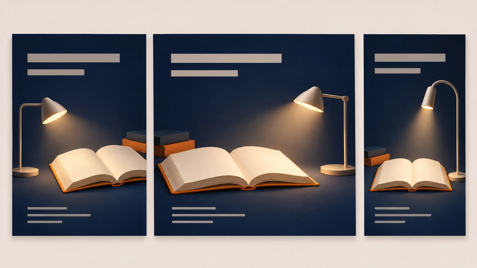
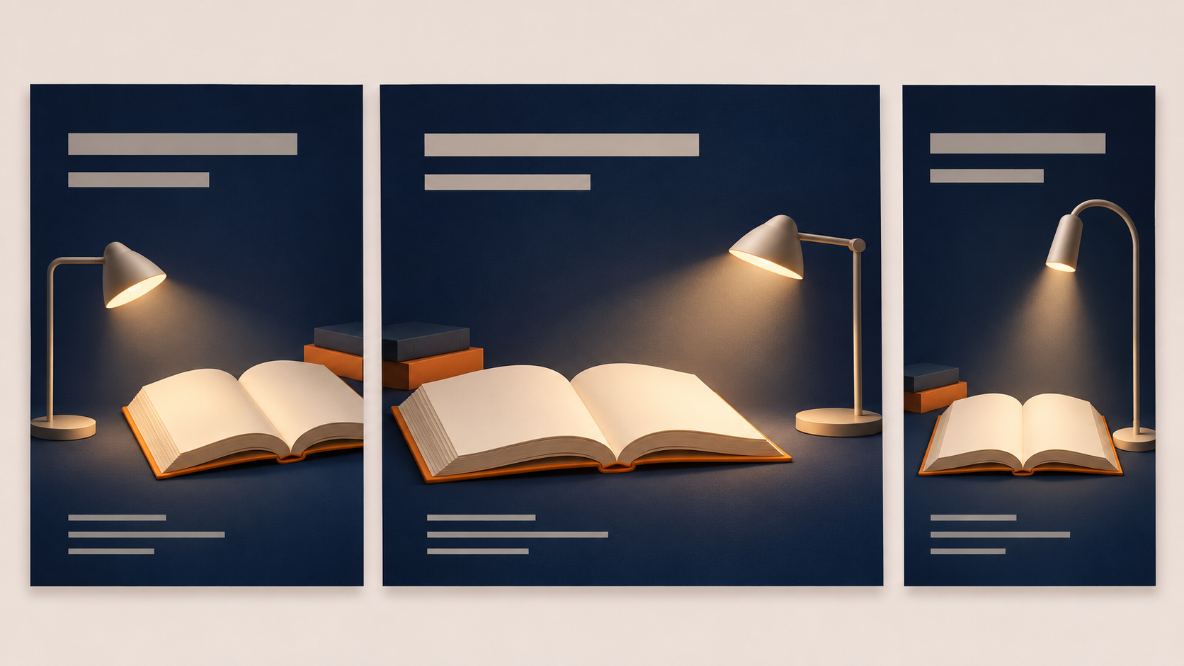
A poster can look like an event announcement without clearly announcing the event. Does the title stand out? Is the year missing from the date? Can someone read the venue when the image appears on a phone? These questions belong in your AI poster generator brief, not just in the final review.
Design.com’s poster generator page describes entering a business name and a short description, then customizing fonts and layouts. That is the vendor’s description of its own product, not evidence that every image generator offers equivalent templates, editing, or exports. For an event poster, treat visual exploration and final typesetting as separate jobs.
Keep one source of truth for the words
The following event is a hypothetical teaching example, not a real announcement or a tested result. Maintain a text brief and copy from it into every layout rather than transcribing generated lettering.
| Item | Example brief | Layout implication |
|---|---|---|
| Event title | After-Dark Book Swap | Make it the main reading entry point |
| Date and time | May 16, 2027, 7–9 p.m. | Group with the venue |
| Venue and organizer | Northbank Bookshop; Northbank Reading Club | Preserve exact names |
| Palette | Deep blue, warm white, a little orange | Keep text areas visually quiet |
| First canvas | 1080 × 1350 pixels | An example size, not a universal platform requirement |
| Open space | Title above, details below | Place books and lighting in the middle |
In this example, readers need the event identity first, followed by when and where it happens. Decorative copy should not displace those facts.
Ask the first draft to solve the composition
Consider generating a background without lettering, then adding approved text separately. This is a suggested prompt, not a promise of results:
> Create a portrait poster background for an evening book-swap event. Use deep blue, warm white lighting, and small orange accents. Place books and soft light in the middle. Leave a simple open area at the top for a title and a clear area below for the date, venue, and organizer. Keep bright objects and busy textures out of the text areas. Do not generate lettering, logos, or QR codes. Aim for a 4:5 composition; set dimensions according to the tool’s available controls.
To start with a new image, open InkRoom image generation, enter your description, and choose from the configured models shown in the interface. Availability, settings, and fees depend on the current interface and account configuration. This entry point does not establish support for poster templates, editable text layers, or precise typesetting.
Judge the draft by whether the title will fit, the detail area stays clear, and the subject can survive the intended crop. A striking image with nowhere to put essential information is not a useful poster background.
Set the final text from the brief
Bring the chosen image into a tool that supports text layout. Add the title, date, venue, and organizer from the approved brief. If a draft already contains generated lettering, do not trust it as the master copy. If that lettering cannot be removed cleanly, choose a text-free background instead.
Proofread names, dates, time ranges, punctuation, and brand information character by character. “Close enough” is not enough for a venue name or a start time. If you add a QR code, create it separately and test it from the final exported file.
Review readability in context. Reduce the poster to approximately its expected phone-feed display size and check whether the title remains prominent and the date and venue are easy to find. For a physical poster, check the intended size and viewing distance. No single font size works for every typeface and placement.
Reflow the layout before cropping
Moving from 4:5 to a square or a 9:16 portrait layout calls for more than stretching the image. Reposition the subject, change line breaks, and move the date and venue together. Keep the wording and reading priority consistent; identical coordinates are unnecessary.
For an existing draft, you can consult the current interface information at InkRoom’s image editing entry before deciding whether it fits the required operation. The supplied facts do not establish specific outpainting, background-processing, or text-editing capabilities, so do not make the adaptation depend on those features being available. Complete the final typesetting separately.
Before publishing, inspect the actual output:
- Dimensions and crop: Check the destination’s current specifications and preview. Keep essential information clear of cropping and interface overlays.
- Copy and branding: Compare every size with the same text brief. Use authorized logo files rather than generated approximations.
- Asset permissions: Check the licenses for photos, illustrations, fonts, and logos against the intended use and modifications. Keep the permission records; an AI-generated background does not establish permission for every asset in the composition.
- Output requirements: Verify exported dimensions for digital use. For print, ask the printer about finished size, bleed, color, and file requirements before preparing the final file.
The visual draft explores mood and composition. The finished poster must communicate exact information. Proofreading and layout connect those two jobs.
Related articles and cases
- AI Makeup Generator: Try the Makeup, Not a Different Face
Preview lip color, eye makeup, and blush on your own photo without confusing a flattering face edit with a useful makeup idea. Includes natural and stage-makeup briefs plus practical checks against the original.
- AI Image Style Transfer: Change the Look, Keep the Details
Separate content references from style references, then handle color, brushwork, and composition as distinct choices. Use two editing rounds to check identity, product shape, text, and logos.
- AI Hairstyle Changer: Compare the Hair Without Changing the Person
Prepare a clear portrait, describe the cut precisely, and compare hairstyle candidates without overlooking changes to your face. Includes a proposed comparison table and checks for hairlines, ears, edges, and lighting—not a tool test or a haircut guarantee.
- AI anime art generator: brief a character and scene you can actually review
Build a single-image anime brief around stable character traits, a readable action, and a specific scene. Then review clothing, hands, props, and storytelling without mistaking a concept image for a reusable character asset.