AI Packaging Design Generator: From Shelf Concepts to Prepress Boundaries
A useful packaging concept helps you make a specific decision. Learn how to hold a brief steady, compare visual directions, and keep generated mockups separate from production-ready artwork.
·
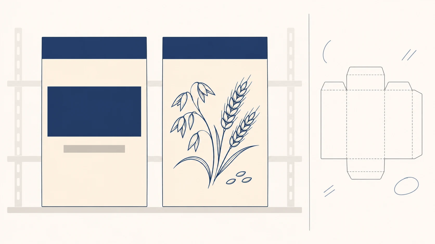
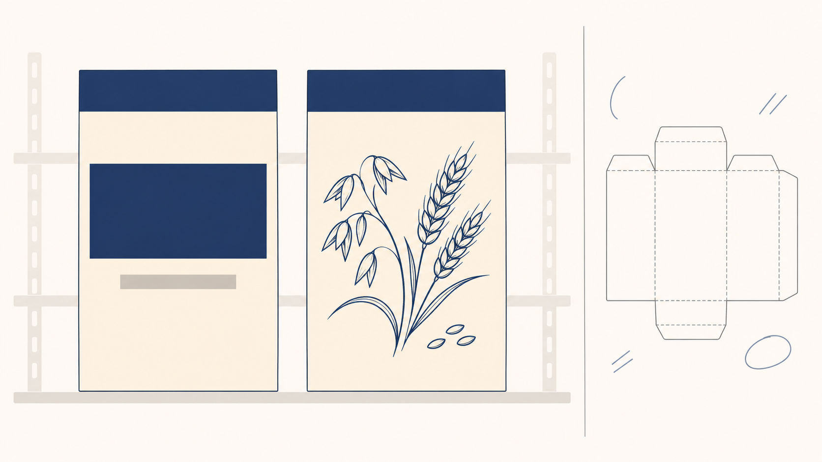
A packaging image can look finished while leaving the important questions unanswered: What will shoppers notice first? Can the direction extend to other variants? What is still missing before a printer can use it?
If you are looking for an ai packaging design generator, aim for concepts you can evaluate—not an apparently finished picture that gets mistaken for production artwork. Mew Design’s packaging tool page explicitly describes generated designs as concepts and mockups, and says dimensions, bleed, color settings, and dieline details need confirmation before production.
Match the image to the decision
For a creator or small team exploring a new package, a useful starting point is one design question: Should the product category lead, or should the brand dominate? Changing the package shape, palette, illustration, and background at the same time makes it difficult to explain why one option was preferred.
| Decision to make | Useful image | What it cannot establish |
|---|---|---|
| What should lead on the front panel? | Front-facing concept | Final small-type legibility or complete back-panel copy |
| Is the pack easy to distinguish in a display? | Shelf illustration with consistent scale and viewpoint | Real shopper attention or sales performance |
| Is the overall appearance worth developing? | Three-quarter mockup | Actual material behavior or manufacturability |
| Can the artwork go to print? | Prepared production files and supplier confirmation | A generated mockup alone cannot answer this |
A shelf illustration is a discussion aid, not a consumer study. An option that looks more noticeable in an image has not thereby demonstrated a conversion benefit.
Separate the fixed brief from the creative variable
Lock the product category, package form, brand colors, required copy, and display context before choosing what to explore. Where wording is not approved, label it as a placeholder. Do not let generated text decide ingredients, net quantity, or product claims.
Here is a hypothetical oat-cluster carton brief. It illustrates a method, not a client project or tested result:
> Create a packaging concept for oat clusters in an upright rectangular carton, aimed at everyday breakfast shoppers and shown for a supermarket breakfast aisle. Keep a light cream base and a dark blue brand area. Reserve spaces for the official logo, product name, flavor, and net quantity. Use clear placeholders for unapproved wording; do not invent ingredient or nutrition claims. Explore only the front-panel hierarchy: one direction emphasizes the product name, another emphasizes a grain illustration. Request front-facing concepts at the same angle and image scale. If the outputs are inconsistent, normalize the comparison conditions manually before reviewing. Treat every image as a concept illustration.
The brief separates stable requirements from the variable under discussion. It is not a guarantee that a model will preserve every constraint. Check the shape, wording, and retained details in the actual output.
To create new images, you can enter the brief in InkRoom’s image generation page and select a configured model. Availability, parameters, and fees depend on the current interface and account configuration. This is an image-generation entry point, not a claim of packaging-specific layout or prepress export capabilities.
Review the reasoning, not just the favorite image
Compare front views at a consistent scale before discussing scene-based mockups. Attractive lighting and backgrounds can influence a preference without improving the package’s information hierarchy.
Write feedback that another person can act on. “This feels premium” leaves the next change unclear. “Keep the name-led hierarchy, reduce the illustration, and give the flavor its own area” identifies both what to preserve and what to revise. If several options distort the logo or contain incorrect text, resolve those errors before treating them as comparable choices.
Check wording against approved copy and logos against official assets you are entitled to use. A convincing label is not evidence that its contents have been approved, nor does it replace packaging-information review for the intended market.
An approved direction is not approved print artwork
A mockup may suggest matte paper, embossing, or metallic detail. That appearance does not confirm a material or manufacturing process.
For handoff, label the chosen image as a direction reference. Include official brand assets, approved copy, and any material or finish intentions that remain unconfirmed. A designer should separately verify dimensions, the dieline version, folds and glue areas, bleed, safe areas, color settings, and final output requirements against the supplier’s production specifications. Do not infer dimensions from a perspective rendering or adopt a generated barcode as production data.
If the only deliverable is a concept image, say so. It supports a visual decision; it is not yet a prepress file. That distinction lets generated variations start a useful design conversation instead of concealing unresolved production work inside a polished picture.
Related articles and cases
- AI Wedding Invitation Generator: Layout, Names, Dates, and Print Delivery
Turn a wedding brief into an invitation visual without treating the generated image as a finished invitation. Plan text hierarchy, verify event details, and prepare digital and print versions separately.
- How to Choose an AI Image Editing API: Inputs, Masks, Async Results and Cost
Evaluate an image editing API against delivery requirements, not just sample images. A developer-focused method for checking input contracts, recovering uncertain requests, testing preservation and reconciling actual costs.
- AI Floor Plan Generator: From Layout Ideas to Measurement Review
Turn room requirements into a conceptual layout without mistaking an attractive image for a measured plan. Learn what to describe, how to compare arrangements, and what to check against original measurements.
- AI YouTube Thumbnail Generator: From Content Promise to Mobile Readability
Turn a video's actual content into thumbnail concepts, compare meaningful layout alternatives, and check text, contrast, and focus on a phone. An illustrative example shows the method without claiming tested results.