AI Logo Generator: From Brand Brief to a Usable Mark
Turn a brand brief into comparable logo concepts, then review actual-size legibility, monochrome use, backgrounds, spelling, rights, and delivery files before adopting a design.
·
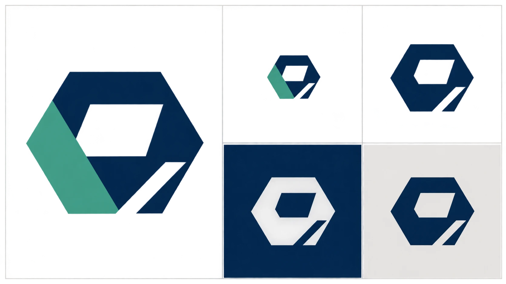
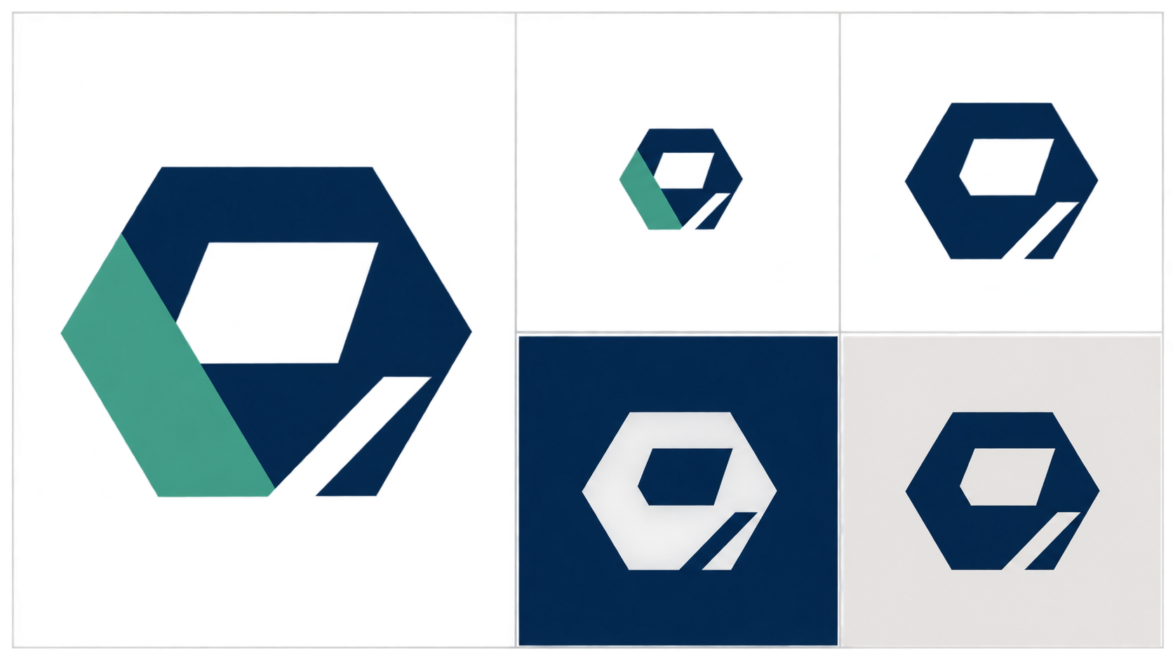
A logo can look convincing in a presentation and still fail in a website header, profile image, or packaging label. With an ai logo generator, the useful goal is not simply more options. It is a shortlist you can evaluate, explain, and develop into an appropriate final asset.
This guide offers a proposed working method for individual creators and small teams. It is not a customer case study or a hands-on product test. Generated images remain design concepts, not rights-cleared brand assets.
Make the brief specific enough to reject a concept
“Modern, professional, distinctive” describes a preference, but gives a team little basis for rejecting a design. Start with the exact brand name and capitalization, the audience, the main use, prohibited elements, and practical color restrictions.
For example: “Primarily for a mobile website header; keep the full name readable; avoid medical symbols; prefer two colors; do not rely on gradients to define the shape.” This is an illustrative brief, not a real client's requirements.
Separate the brief into two layers:
- Fixed requirements: name, audience, primary applications, prohibited elements, and necessary color constraints.
- Exploration variables: wordmark-led or symbol-led, geometric or organic, compact or open composition.
The first layer establishes eligibility. The second gives you meaningful design directions to compare. Changing the positioning, name, and visual treatment together makes it difficult to understand why one result works better.
Compare design directions, not just palettes
Design.com's AI logo page describes using a business description and name, shortlisting concepts, editing them, and previewing applications. That helps identify the scope of the reader's task. Its claims about speed, originality, and licensing remain the provider's statements—not independent findings or descriptions of InkRoom.
For your own exploration, you might compare a wordmark-led direction with a symbol-led direction while keeping the brief unchanged. The former tests how the name reads and sits in a layout; the latter tests whether a graphic can carry recognition on its own. There is no need to retain an unsuitable direction merely to fill a presentation.
A useful input structure is:
> Explore a logo concept for [exact brand name and spelling], serving [audience], primarily used in [application]. Explore only [one visual direction] in this round. Retain [required elements], avoid [prohibited elements], and follow [color constraints]. Show a simple, flat design so the shapes and lettering can be compared without a dimensional sign or packaging scene hiding details.
This is a briefing aid, not a guaranteed-result prompt. If lettering remains inaccurate, keep the promising symbol concept and have a designer construct the wordmark using a font with suitable licensing, rather than repeatedly regenerating everything.
In InkRoom's image-generation workspace, you can enter the prepared prompt and select a configured model shown in the current interface to explore draft images. Availability, parameters, and fees depend on the interface and account configuration. This is an image-generation entry point, not a promise of dedicated logo editing, vector delivery, or trademark clearance.
Attach a specific observation to each shortlisted concept: “The name stays readable when reduced, but the internal symbol detail needs simplifying.” That gives the next revision a clearer purpose than “I prefer this one.”
Review the mark where it will actually appear
Inspect the flat artwork before relying on application mockups. Materials, lighting, and packaging can explain context, but they should not substitute for checking the underlying design.
| Review condition | What to inspect | Suggested response to a problem |
|---|---|---|
| Smallest intended display size | Readable name, thin strokes, gaps, and enclosed spaces in letters | Simplify details or develop a separate small-size version, then review again |
| One-color version | Whether the outline and components remain understandable without color differences | Revise the shapes rather than relying on gradients or color separation |
| Dark and light backgrounds | Disappearing edges or lettering; intended transparent areas | Check positive and reversed versions separately; do not assume automatic inversion works |
| Exact name and capitalization | Missing or extra letters, look-alike characters, misleading spacing | Compare character by character and reset the lettering manually if necessary |
There is no universal passing pixel size. A favicon, storefront sign, and printed label have different viewing conditions. Review at the intended size and ask the production supplier about relevant requirements. A screen preview does not replace a print proof.
Keep file approval separate from rights review
Passing visual review means the version meets the conditions you actually checked. It does not settle the following questions.
Trademark conflicts: Search the name and similar marks in the intended markets and goods or services, and seek appropriate professional advice when concerns arise. Generating an image, finding no obvious visual match, or purchasing a tool subscription does not by itself establish registrability or freedom from infringement.
Font licensing: Keep the names, sources, and license terms of the fonts actually used. Check whether the terms cover the proposed logo, commercial use, and delivery arrangements. Being able to download a font is not evidence of permission for every use.
Delivery files: Ask the website maintainer, printer, or fabricator what they need before approving the package. A transparent raster image can suit relevant digital uses. Where editable vector artwork is required, verify the contents—not just the extension. A bitmap placed inside an SVG or PDF is not equivalent to an editable vector logo. Retain source artwork, approved versions, and licensing records for maintenance.
If all you have is a generated concept, with fonts, rights, or required files still unresolved, label it “pending production/review,” not “ready to launch.” The generator has helped narrow a direction; it has not finished every part of the identity project.
Related articles and cases
- AI Wedding Invitation Generator: Layout, Names, Dates, and Print Delivery
Turn a wedding brief into an invitation visual without treating the generated image as a finished invitation. Plan text hierarchy, verify event details, and prepare digital and print versions separately.
- How to Choose an AI Image Editing API: Inputs, Masks, Async Results and Cost
Evaluate an image editing API against delivery requirements, not just sample images. A developer-focused method for checking input contracts, recovering uncertain requests, testing preservation and reconciling actual costs.
- AI Floor Plan Generator: From Layout Ideas to Measurement Review
Turn room requirements into a conceptual layout without mistaking an attractive image for a measured plan. Learn what to describe, how to compare arrangements, and what to check against original measurements.
- AI YouTube Thumbnail Generator: From Content Promise to Mobile Readability
Turn a video's actual content into thumbnail concepts, compare meaningful layout alternatives, and check text, contrast, and focus on a phone. An illustrative example shows the method without claiming tested results.