AI Image Upscaler: How to Tell Whether Enlarged Details Are Usable
A 2x or 4x enlargement adds pixels, not proof of accurate detail. Start with the required dimensions, then check text, logos, faces, and product textures against what you can actually verify.
·
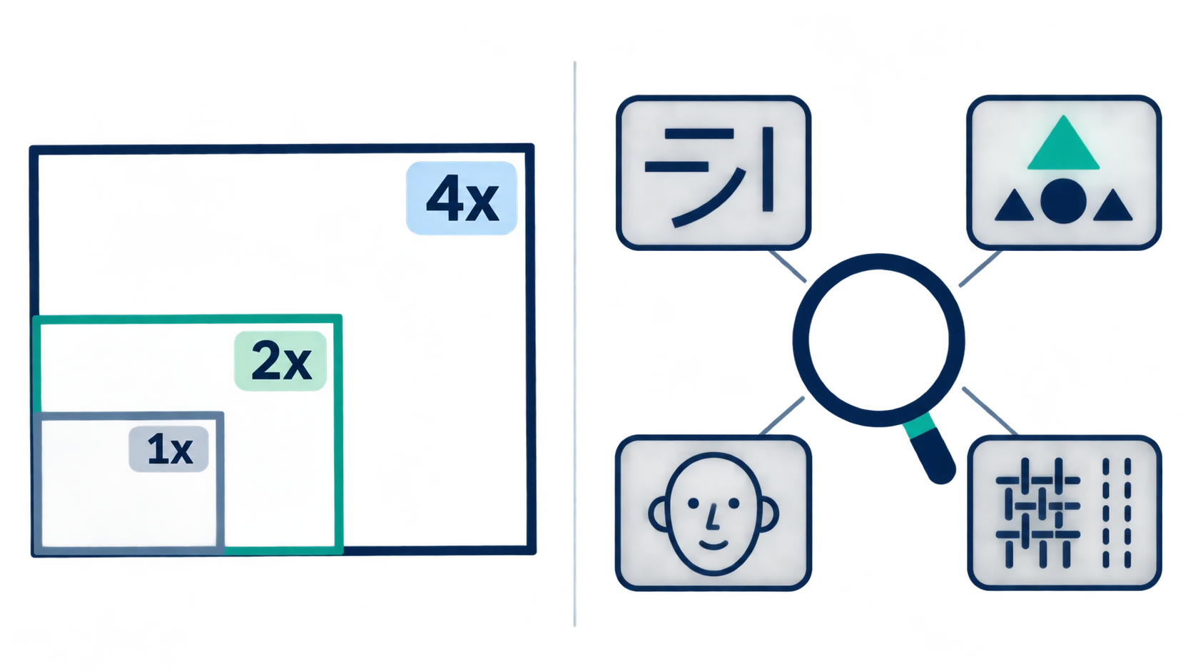
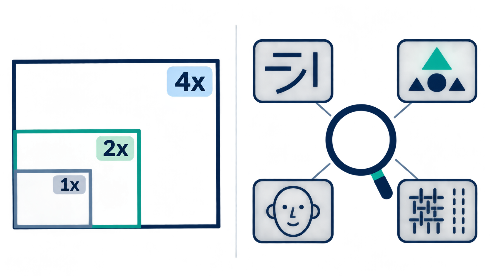
An enlarged image can have cleaner outlines and still contain a wrong letter on the packaging. When using an AI image upscaler, separate two questions: does the file meet the required dimensions, and has important content changed?
ImgUpscaler’s own explanation makes the distinction explicit: AI generates detail rather than recovering an exact original. More pixels can solve a sizing problem without establishing that the added detail is accurate.
Start with where the image will appear
Record the original pixel dimensions and the dimensions required by the intended placement. A product thumbnail, a presentation illustration, and a detail image meant to show a readable label do not need the same level of fidelity.
Suppose an 800 × 600-pixel image is needed for a 1600 × 1200-pixel placement. A 2x enlargement meets that dimensional requirement. There is no reason to make 4x the default simply because it is the larger number. This is a sizing calculation, not a prediction that a particular 2x output will be acceptable.
Also note what the source cannot establish. Is the label already unreadable? Is the face too small to inspect? Has compression flattened the product texture? If a detail cannot be confirmed in the source, a plausible-looking version in the enlarged image remains unverified.
What 2x and 4x actually increase
The scale applies to both width and height. The reference page defines 2x and 4x as doubling or quadrupling each dimension. Because total pixel count is width multiplied by height, it increases by a different factor.
This is a calculated example, not a tool test. It assumes no resizing before processing, no cropping, and no output-size cap.
| Setting | Width × height | Total pixels | Relative pixel count |
|---|---|---|---|
| Original | 800 × 600 | 480,000 | 1× |
| 2x | 1600 × 1200 | 1,920,000 | 4× |
| 4x | 3200 × 2400 | 7,680,000 | 16× |
Sixteen times as many pixels does not mean sixteen times as much authentic detail. It does not establish the file size, either. Read the downloaded file’s actual dimensions rather than recording only the selected scale. The reference page notes that large uploads may be resized before processing, so the scale button alone may not describe the relationship between the original file and the final output.
Check clarity and accuracy separately
Use two views. First, inspect the whole image at its intended display size to judge whether the subject and overall appearance work for the placement. Then inspect the output at 100% for local defects. When comparing shapes between the original and the result, use matching display dimensions and the same crop so that a larger on-screen image is not mistaken for a better one.
For text and logos, verify identity before sharpness. Compare letters, numbers, decimal points, strokes, and logo proportions with reliable label copy or brand artwork. A crisp character that has become a different character is still wrong. Without a reliable reference, mark the content as unverified rather than guessing from its apparent readability.
For faces, look for preserved features. Compare eye and mouth shapes, tooth boundaries, and facial marks that are actually visible in the source. More defined eyelashes or smoother skin do not establish authenticity. Where faithful depiction matters, uncheckable new features should not be described as a successful restoration.
For product textures, follow structure rather than grain. Trace seams, weave, wood grain, or engraved lines. Look for changes in direction, unexpected branches, repetition, or a pattern that has turned into something else. More visible texture does not prove a closer match to the physical material.
Also look for light or dark fringes beside high-contrast edges and unnatural repetition within textures. Treat them as inspection clues for sharpening artifacts or generated irregularities, not as proof of a specific processing algorithm. No source images were visually inspected for this article, and these are suggested checks rather than tool-test findings.
Keep a record that explains the decision
For each candidate, record the original dimensions, actual output dimensions, intended use, settings, and the specific difference that determines acceptance. “The last label digit differs from the verified artwork” is more useful than “quality looks average.”
An output might meet the size requirement for a product-list thumbnail while leaving packaging text unverified. That does not make it suitable for a detail page where the label must be readable. Acceptance belongs to a particular use, not to a universal claim that the image has improved.
If the dimensions are sufficient but content has changed, consider a lower-scale candidate, a smaller display size, or a better source file. These are options to evaluate, not guaranteed fixes. For text or identity that must be accurate, reliable reference material matters more than convincing-looking invented detail.
The useful final statement is where and at what size the image can be used, with any unverified content noted. “Upscaled to 4x” does not answer that question.
Related articles and cases
- AI Ghost Mannequin Generator: Keep the Garment, Change the Presentation
Use garment reference photos to define what an AI edit should preserve, identify hidden areas that need evidence, and separate a visual concept from an accurate product image.
- AI Virtual Ring Try On: References, Proportion, and Better Corrections
Prepare hand and ring references, compare styles without confusing visual scale with ring size, and identify problems in settings, perspective, contact, and shadows.
- AI Image Relighting: Check Skin Tones, Materials, and Color Shifts
Better-looking light is not always more faithful light. Learn how to compare a relit image with its original, assess skin and material changes, and decide when to roll back.
- AI Image Extender: Add Room Without Stretching the Subject
Adapt an existing photo for a banner, portrait layout or product card by planning where new space belongs. Use worked canvas dimensions and practical edge checks without treating generated scenery as recovered fact.