AI Image Extender: Add Room Without Stretching the Subject
Adapt an existing photo for a banner, portrait layout or product card by planning where new space belongs. Use worked canvas dimensions and practical edge checks without treating generated scenery as recovered fact.
·
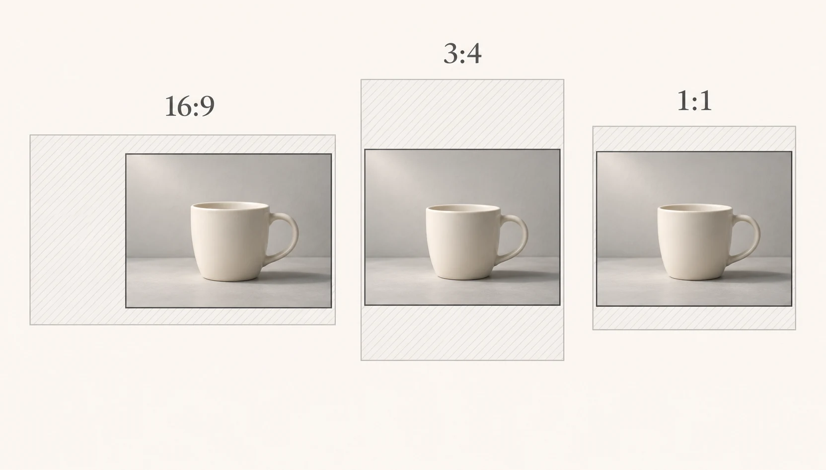
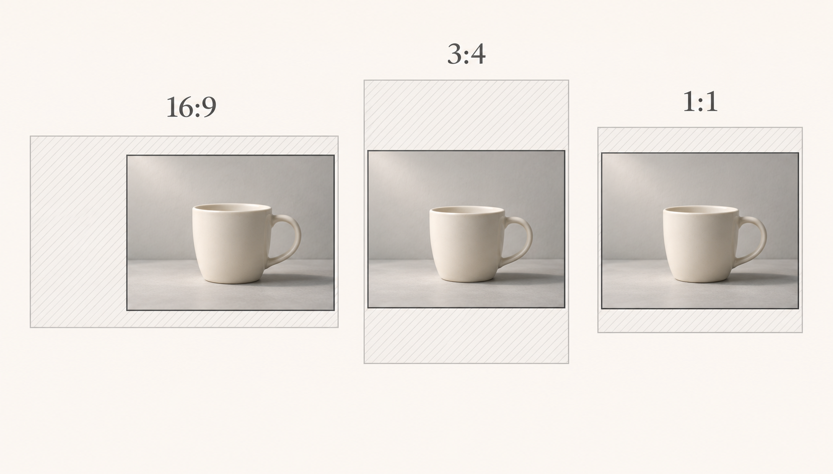
The subject in a photo can be right while the frame is wrong for its next use. A banner needs room for a headline, a portrait layout feels cramped above the subject, or a product card needs more breathing space. Stretching the whole image is not the answer.
An AI image extender generates content beyond an image’s existing boundaries. It does not recover a verified record of what was outside the frame. Pixelcut’s uncrop page describes adjusting the canvas and generating surrounding details. That explains the basic task; it does not establish that every extension will blend correctly.
Give the added space a job
Before choosing a ratio, identify what must stay intact: faces, hands, product outlines, packaging text and existing marks. Then decide which side actually needs more room.
For a banner with a headline on the left, the extension should serve that left-hand layout rather than automatically splitting the added width equally. Continue the background without introducing prominent objects where the text needs to sit.
For a portrait layout, decide whether the missing space belongs above or below the subject. Extending downward into table legs, floor tiles or architectural lines creates a geometry problem, not just a color-matching problem.
For a product card, added background can separate the product from the card edge or accompanying text. It should not reinterpret a cap, invent packaging copy or alter the product’s thickness. If part of the product itself is missing, another complete source photo is generally a more dependable reference than a generated guess.
Work out the canvas before generating it
These are planning examples, not platform specifications, supported tool dimensions or measured outputs. Assume a 1200 × 900-pixel original that is neither scaled nor cropped during planning:
| Target layout | Example canvas | Space to add |
|---|---|---|
| 16:9 banner | 1600 × 900 | 400 pixels across the horizontal axis |
| 3:4 portrait | 1200 × 1600 | 700 pixels across the vertical axis |
| 1:1 product card | 1200 × 1200 | 300 pixels across the vertical axis |
For a target width-to-height ratio, keep the original width and calculate the required height as original width × target height ÷ target width. If that would make the canvas shorter than the original, keep the original height instead and calculate the required width. This avoids cropping in the plan.
The extra space need not be symmetrical. All 400 pixels of added width could go on the headline side, or you could divide them to suit the composition. Set final export dimensions separately for the destination and the tool. A larger canvas does not itself add detail to the original subject.
Once the protected area, target ratio and extension direction are clear, the InkRoom editing entry is an approved starting point for an existing-image editing task. Check the current interface for the canvas-extension operation you need before proceeding. The entry alone is not confirmation of a dedicated extender feature, its settings or its results. If the required operation is unavailable, stretching the subject is not a substitute.
Inspect relationships, not just the seam
A hidden seam can still lead into an implausible scene. A useful review is to compare the original and result side by side, check the subject first, then follow the original boundary outward.
Perspective: follow the lines. Table edges, horizons and floor tiles should continue along compatible paths. A tabletop that suddenly widens or a line that changes direction is a structural error, not merely a texture blemish. Where the tool allows it, try a smaller generation region or a less ambitious extension; otherwise reconsider the framing from the original.
Lighting: compare direction and placement. Highlights, dark surfaces and shadows near the subject need to agree. If the source is lit from the right but the extension introduces an unexplained opposing shadow, the result is not ready simply because the added area looks attractive.
Texture: look for copied patterns. Clumps of sand, leaves or wall marks may repeat in ways that disappear at thumbnail size. Regular tiles raise a different question: do spacing and joins continue correctly? Review at native size for local defects and at the intended display size for visual distractions.
Subject boundaries: check for rewritten details. Compare hair, fingers, transparent edges, product contours and packaging text. Invented background may be acceptable creative material; invented product information is not. If the change reaches into the subject, return to a version that preserves it rather than polishing only the outer seam.
A small background join may be suitable for local regeneration or edge repair when supported. Incorrect perspective, identity or product structure calls for a revised composition. Keep the original at delivery and treat the extension as generated material. In documentary, evidentiary or factual product contexts, do not present the added area as part of the original photographic record.
Related articles and cases
- AI Image Relighting: Check Skin Tones, Materials, and Color Shifts
Better-looking light is not always more faithful light. Learn how to compare a relit image with its original, assess skin and material changes, and decide when to roll back.
- ai image eraser: What to Check After the Object Is Gone
Removing a distraction is only part of the edit. Define what must stay unchanged, then compare the repair with the original for repeated textures, misplaced shadows, merged edges, and altered text.
- AI Image Prompt Generator: Turn a Vague Idea into a Testable Brief
Define the image’s job and essential details before adding style keywords. Use a reusable brief, compare short and structured prompt examples, and revise one variable at a time without mistaking a clearer prompt for proven image quality.
- AI Image Generator for Social Media: From Visual Brief to Format Review
Separate the image you want to generate from the information that must stay exact. Build a base image, add approved copy, and review each placement as its own design.