AI Image Relighting: Check Skin Tones, Materials, and Color Shifts
Better-looking light is not always more faithful light. Learn how to compare a relit image with its original, assess skin and material changes, and decide when to roll back.
·
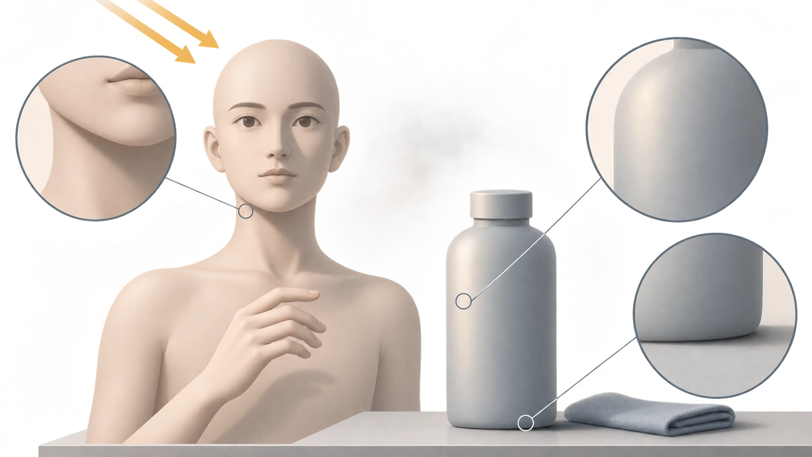
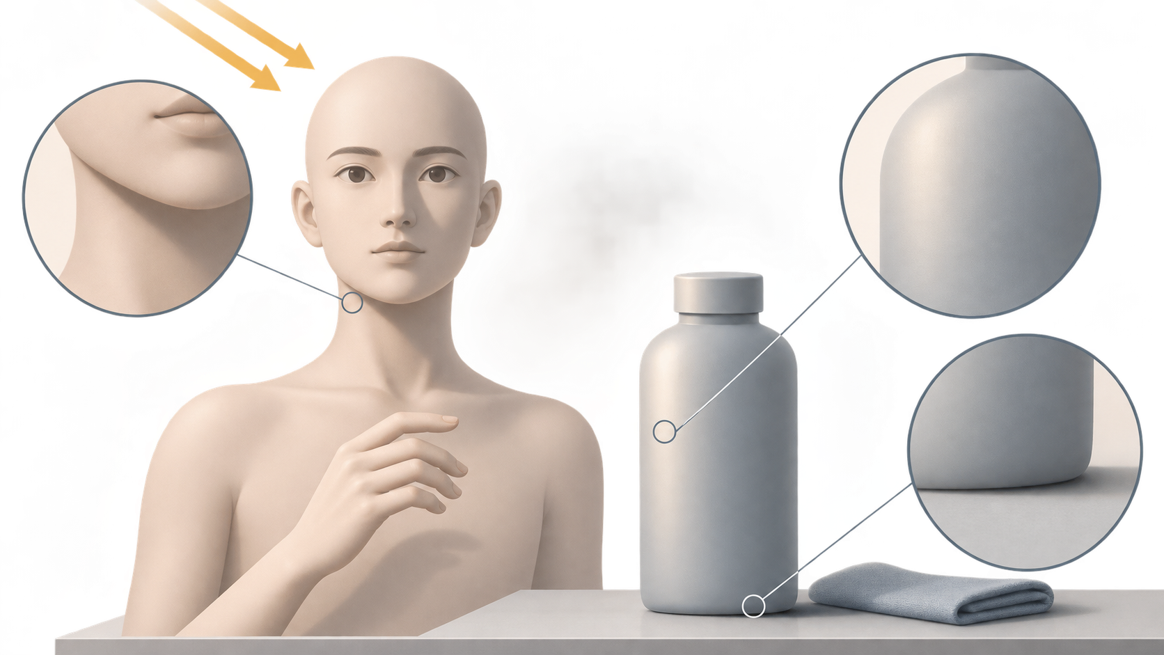
A warmer portrait may feel more inviting. A warmer product photo may make the wrong shade look right. With AI image relighting, the useful question is not simply whether the lighting looks better, but whether the edited image still serves its purpose.
Keep the original as a comparison, not as automatic proof of accurate color. The method below is a suggested editing approach, not a tool test or a guide to lighting a physical set.
Mood and color reference are different jobs
For a creative portrait or social post, warmer light and stronger contrast can be intentional. For a foundation shade, garment color, or surface finish, those same changes can interfere with what the viewer needs to judge. An edit can suit the first job and fail the second.
Evoto’s AI Relight page describes Natural Light and Golden Hour presets. It says the natural-light look works best on images that already have a believable light source, such as outdoor or window-lit scenes. That is useful context for the task, but it is a description of that product—not independent evidence that every relighting tool preserves color or texture, and not a statement about InkRoom’s features.
Before editing, write down both the intended change and what must remain unchanged. For example: “Make the side lighting more noticeable without changing facial features or the relationship between skin tones.” For a product: “Lift the dark side while retaining the bottle’s color and matte finish.” These are editing targets, not guaranteed outcomes.
Follow the light, then inspect what changed
Start with the whole image to judge the lighting, then zoom in to judge the details. Treat the following as reasons to investigate, not automatic failures: reflected light, multiple sources, and complex materials can legitimately produce different highlight directions.
| Area | Compare with the original | Reason to withhold the edit |
|---|---|---|
| Skin | Face-to-neck, ear, and hand color relationships; detail in bright areas | Only the face turns orange or gray, facial features change, or highlight detail disappears |
| Material highlights | Highlight width, edges, and transitions relative to the original surface | A matte finish looks polished, fabric looks plastic, or defining texture disappears |
| Shadows | Shadows beneath the nose, jaw, and product; contact with the supporting surface | The subject appears to float, or the light and shadow changes cannot be explained by the scene |
| Product color | Colored midtones, not only the brightest highlights or deepest shadows | The shift could affect shade selection or make variants difficult to distinguish |
Portraits: a brighter face is not the whole result
The face may become brighter while the neck and hands retain the original color temperature. Toggle between versions and look for a change confined to an implausible region. Inspect the eyes, nose, and mouth for altered shapes or transitions as well.
An overall warm treatment can suit a mood portrait, but warmth should not conceal changed facial features. If the job requires reliable skin-color presentation and there is no trustworthy color reference, an attractive edit cannot establish accuracy. Keep the original or use source material with a verifiable color basis.
Products: highlights help describe the finish
A bottle can retain its outline while appearing to have a different finish. A broad, soft highlight becoming narrow and hard may change how viewers read its gloss. Fabric, leather, and metal need their own material-specific judgment; “brighter and clearer” is not a universal acceptance rule.
For product images used to choose colors, retain a separate version with a reliable color basis. A mood treatment should not replace it. If the original already has a color cast, rolling back only undoes this edit—it does not make the original color-accurate.
Separate direction, brightness, and warmth
Save an untouched original. Then describe light direction, brightness, and color temperature separately. If the chosen tool supports those changes, try one dimension at a time: side lighting first, a brightness adjustment next if needed, then warmth. This makes it easier to identify which change affected skin or material appearance than a single request to “make it more natural.”
To continue working with an existing image in InkRoom, open the image editing entry and first check whether the current interface supports the lighting change you need. Use only the functions actually available. This entry is not being presented as a dedicated relighting tool or a promise of directional controls, color preservation, or particular presets.
Compare versions on the same display, with the same display settings and viewing scale, without applying different extra filters. That reduces comparison noise; it is not color calibration. Matching crops can help you inspect the face-to-neck boundary, a product highlight, or its contact shadow.
Roll back to the original or an earlier acceptable version if improved lighting changes identity, product color, or the apparent material. Plausible-looking texture in an area that lacked detail is not proof that real information was recovered. Choose the version that fits the image’s job, not automatically the most dramatic one.
Related articles and cases
- AI Image Upscaler: How to Tell Whether Enlarged Details Are Usable
A 2x or 4x enlargement adds pixels, not proof of accurate detail. Start with the required dimensions, then check text, logos, faces, and product textures against what you can actually verify.
- AI Ghost Mannequin Generator: Keep the Garment, Change the Presentation
Use garment reference photos to define what an AI edit should preserve, identify hidden areas that need evidence, and separate a visual concept from an accurate product image.
- AI Virtual Ring Try On: References, Proportion, and Better Corrections
Prepare hand and ring references, compare styles without confusing visual scale with ring size, and identify problems in settings, perspective, contact, and shadows.
- AI Image Extender: Add Room Without Stretching the Subject
Adapt an existing photo for a banner, portrait layout or product card by planning where new space belongs. Use worked canvas dimensions and practical edge checks without treating generated scenery as recovered fact.