AI Color Palette Generator: Extract Colors for a Consistent Image Series
Turn colors from an AI image into a working palette: record HEX/RGB values, assign roles, check actual contrast pairs, and reuse the palette in edits or new images without treating one picture as a brand standard.
·
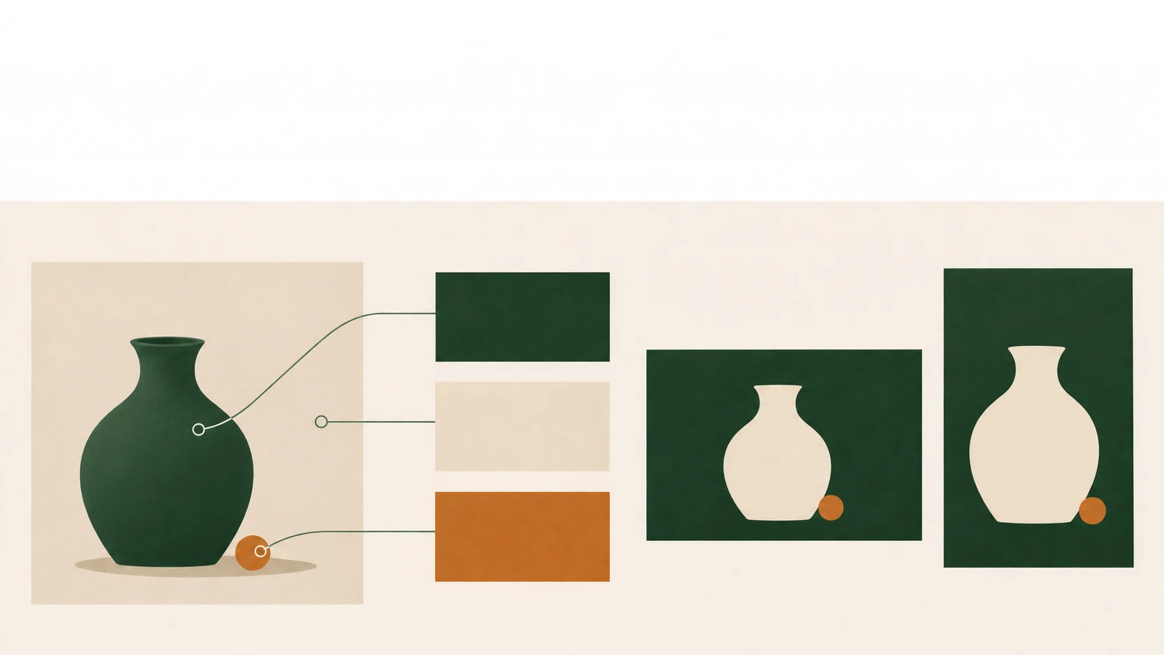
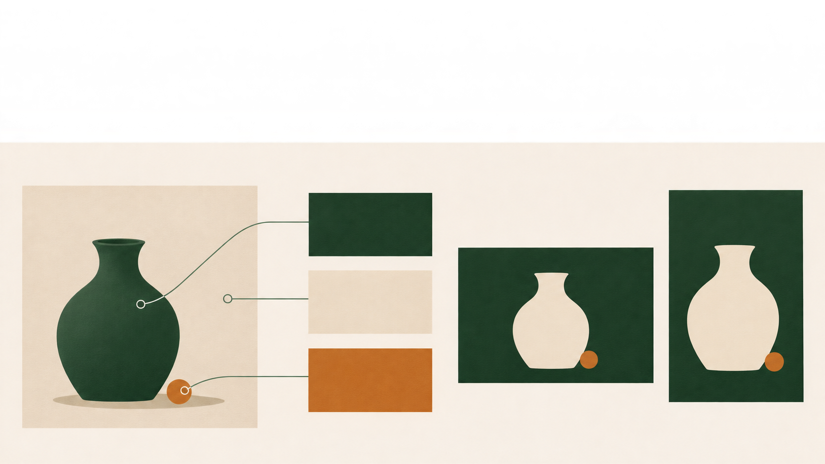
An AI image can have a convincing color mood without providing a useful palette for your next poster. A large background may produce several nearly identical swatches, while the small accent that makes the picture memorable needs a manual sample.
Use an ai color palette generator to find candidates, not to declare a finished brand system. For a visual series, the useful question is which colors should carry across images—and which belong only to the lighting, shadows, or scenery in this one picture.
Separate the picture’s dominant color from the series’ signature color
Start with the next assets you need. If a campaign needs both a wide cover and a vertical poster, are you trying to preserve the background mood, the subject’s color, or a distinctive accent? That decision should guide your selection.
Assign jobs to the colors: a broad background, a supporting tone, or a small identifying accent. These do not need a fixed percentage split. The color occupying the most pixels does not automatically deserve the leading role in the series.
A warm highlight in an AI image may belong to its lighting rather than to the identity you want to reuse. Do not promote it into the palette just because an extractor selected it.
Keep the sample’s origin alongside its intended use
Use an extraction tool that accepts images and record the values it actually displays. Sampling controls, RGB export, and other options depend on the tool. An “AI” label does not establish that it recognizes subjects, preserves small accents, or checks readability.
Keep the original image as your sampling reference. If the background overwhelms the subject’s colors, sample a subject crop separately and label that crop. Its palette is not a measurement of the whole image’s color distribution.
Review near-duplicates and incidental colors. Do you need every variation of the background? Is the bright sample part of the object or merely an edge reflection? A deliberate sample from a representative region may be more useful than requesting more swatches.
The reference article’s extraction workflow also calls for human judgment after extraction. Its unverified tool comparisons and broad algorithm claims are not used here.
The following is a hypothetical recording example—not an extraction result, a tested palette, or a contrast recommendation:
| Candidate | HEX / RGB, recorded as sRGB | Proposed role | Still to check |
|---|---|---|---|
| Deep green | #24483E / 36, 72, 62 | Subject or supporting block | Whether a large area feels too heavy |
| Light beige | #E8E0D2 / 232, 224, 210 | Background candidate | Contrast against the actual text color |
| Copper orange | #C67A42 / 198, 122, 66 | Small accent | Competition with the subject; text/background contrast if it carries text |
In a real project, associate the record with the source file, sampling region, and palette version. If you adjust a value for readability, save it as an application variant rather than overwriting the sample. This separates a color found in the image from one designed afterward.
Check contrast for foreground/background pairs, not for isolated swatches. A cover title, a button label, and text over a translucent overlay have different conditions. If text crosses a gradient or detailed image, testing two flat palette colors does not establish readability across the finished asset.
Try the palette on one composition before expanding the series
For the first trial, keep the same source image and composition brief and change only the color instructions. This is a comparison method, not a promise that a generator can lock composition. If the subject moves or the framing changes, color is no longer the only variable.
Editing an existing image. Once you have recorded the palette and checked its intended uses and contrast pairs, the InkRoom image editing entry is an option for the follow-on editing task. It is not presented here as a palette extractor or contrast checker. Whether the required adjustment is available depends on the current interface.
An adjustment request might read: “Use the original image as the reference. Keep the subject, viewpoint, and layout as close as possible. Move the background toward light beige, retain deep green on the subject, and use copper orange only as a small accent. Do not add text or objects.” Attach color values as targets, not as proof that the output will reproduce exact HEX values. Review framing, subject details, materials, and lighting as well as the overall color shift.
Creating a new image. For a new scene in the series, the InkRoom image generation entry allows prompt input and selection from currently configured models. Availability, parameters, and fees depend on the interface and account configuration. Reuse the subject and composition description while changing the color constraints to reduce comparison variables; inspect the output manually.
For flat graphics or text requiring exact values, finish those elements in a layout or drawing tool with direct color controls. A generation prompt is not color calibration.
Extraction, palette application, and generative recoloring are different tasks
Reading candidate colors from an image is extraction. Applying chosen colors to artwork is a separate operation. Asking a generative tool to change a scene’s colors also involves image generation. Evidence that a tool performs one task does not establish the other two.
The Adobe documentation body was not available for this draft. Consequently, this guide does not provide verified Illustrator Color Theme Picker instructions, menu paths, or a feature comparison with generative recoloring.
Once the palette works across different formats, document the series agreement: which colors stay, which may vary with the scene, and which are reserved for backgrounds or text. That is a useful working palette for this set of assets—not a complete brand standard established by a single AI image.
Related articles and cases
- AI Brand Mascot Generator: From Character Brief to Channel Assets
Define what must stay recognizable before expanding a mascot into expressions, poses, and layouts. Use a front-view reference and actual placement checks to turn a promising image into a manageable set of brand assets.
- AI Image Generation for Print on Demand: From File to Product Sample
A poster, mug, and garment give the same artwork different boundaries. Learn how to relate pixels to print size, adapt the composition, preserve upload versions, and examine samples without treating generated artwork as automatically print-ready.
- AI Image Licensing for Ecommerce: Permissions and Product Accuracy
Separate output terms, third-party asset licenses, input permissions, and product accuracy. Use an image-level record tied to the SKU without treating tool access as permission to publish.
- AI Concept Art Generator: From Exploration to a Clear Visual Direction
Turn a visual brief into comparable concept drafts, choose a direction for specific reasons, and document revisions. A fictional coastal signal station shows how to explore designs without mistaking concept images for production-ready game assets.