AI Brand Mascot Generator: From Character Brief to Channel Assets
Define what must stay recognizable before expanding a mascot into expressions, poses, and layouts. Use a front-view reference and actual placement checks to turn a promising image into a manageable set of brand assets.
·
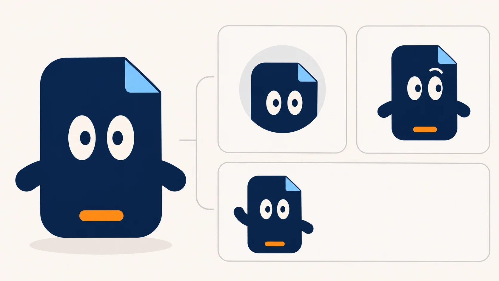
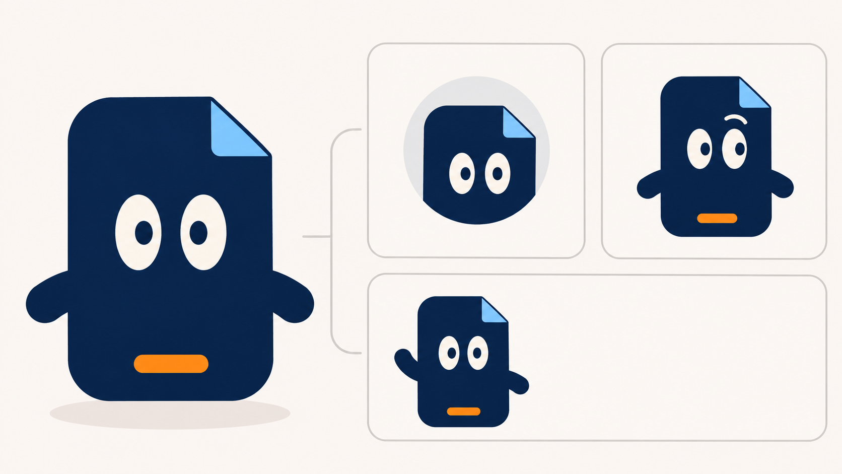
A mascot can look charming at full size and become an indistinct blob in a profile icon. When using an ai brand mascot generator, the useful question is not just “Can it make a good image?” It is “What must remain recognizable when the expression, pose, and placement change?”
The workflow below is a suggested design method, not a model test or a promise of automatic character consistency.
Start with where the mascot will appear
List the assets you actually need: perhaps a profile icon, a welcome-screen illustration, and a horizontal content card. Each asks something different of the character. An icon depends on the head silhouette; a welcome screen may need a readable gesture; a card needs room for copy.
Before adding elaborate clothing, decide on the smallest combination of features that identifies the mascot.
Separate the brief into two groups:
- Fixed features: proportions, silhouette, placement of primary and accent colors, eye shape, signature accessories, brand tone, and prohibited elements.
- Variable features: expression, gesture, body orientation, background, and position within the frame.
Do not write only “blue and orange.” Specify which parts use each color. Translate tone into visible choices, too: a patient, dependable character might use relaxed poses and restrained expressions rather than celebrate in every image.
Masko’s product description treats brand colors, rules, and props as character references and explicitly calls for reviewing each result before use. The useful principle here is retaining rules and reviewing outputs—not assuming its consistency claims apply to another tool.
Write a brief for the first reference image
Here is a fictional design exercise, not an existing brand case or a trademark-cleared concept: a rounded bookmark sprite for a reading-habit app.
> Brand mascot concept sketch: a rounded bookmark sprite, front view, full body, flat illustration. Fixed features: a top corner folded to the right, a dark-blue body, a short orange strip at the bottom, two oval eyes, and short arms. Patient and friendly, without exaggerated cuteness. Simple light background, with arms clearly separated from the body silhouette. No text, logos, extra accessories, or recognizable existing character elements. For this draft, use a neutral expression with both arms resting down.
The description makes requirements reviewable; it does not guarantee that a model will follow every detail. Replace the example with your actual brand rules. Record color codes as targets if available, but do not treat a prompt as proof of color accuracy.
With the brief ready, you can enter it in InkRoom’s image generation entry and select a currently configured model. Availability, parameters, and costs depend on the current interface and account configuration. Choose a front-view reference that meets the brief, then make a separate draft for an intended placement before commissioning a whole asset set.
Expand expressions separately from poses
Keep the selected image and a written record of its fixed features. Where your chosen tool supports image references, use it as a reference; otherwise, keep it alongside new outputs for manual comparison.
First, hold the front view and pose steady while changing only the expression—for example, neutral to mildly puzzled. Check the eye placement, folded corner, and color placement before trying a wave or a pointing gesture. Separating these changes makes it easier to identify where a mismatch entered the design.
An application draft needs layout instructions as well: place the character on the left, reserve space for copy on the right, or direct its gesture toward a particular interface area. Add final copy during layout rather than treating generated lettering as approved text.
If you already have a selected image to edit or adapt, open the existing-image editing entry and use the functions currently offered in the interface. The entry is not a guarantee of character locking, preserved proportions, or a particular export format. Compare each edited result with the reference.
Review it in the actual placement
Put candidates into their intended layouts and inspect them at actual display size. This is a proposed review matrix, not a report of test results.
| Check | How to inspect it | What to change first |
|---|---|---|
| Expression | Compare the neutral and new expression in the same pose | Restore eye placement and head structure; change only what the expression needs |
| Pose | Compare the fold, color areas, and limb connections with the reference | Correct the drifting feature without also redesigning the background and style |
| Small icon | Use the real crop and display size | Simplify detail, change the crop, or enlarge the head—not just the resolution |
| Light and dark backgrounds | Place the image on the intended backgrounds | Adjust silhouette contrast or background; inspect edges if a transparent file is available |
| Wide or tall layout | Use the final composition with its copy area | Reposition the mascot so key features survive the crop and gestures do not cover text |
If a signature accessory works only at large sizes, reconsider whether it should carry the character’s identity. If an expression requires rebuilding the entire face to read clearly, a subtler expression may be a better choice.
Keep visual approval separate from rights clearance
Package the approved reference, character rules, prompts, manual changes, and accepted application versions together. Record model names and settings where the interface provides them. Such records support traceability, not guaranteed reproduction.
Trademark and existing-IP suitability require a separate review. “AI-generated,” “not prompted to imitate,” and “looks different from the reference” are not sufficient evidence of commercial clearance. Check source-material rights, applicable tool terms, and relevant requirements in the intended market; seek professional advice where needed. A visual review establishes whether an asset follows your design brief, not whether you have every right required to use it.
Related articles and cases
- AI Image Generation for Print on Demand: From File to Product Sample
A poster, mug, and garment give the same artwork different boundaries. Learn how to relate pixels to print size, adapt the composition, preserve upload versions, and examine samples without treating generated artwork as automatically print-ready.
- AI Image Licensing for Ecommerce: Permissions and Product Accuracy
Separate output terms, third-party asset licenses, input permissions, and product accuracy. Use an image-level record tied to the SKU without treating tool access as permission to publish.
- AI Concept Art Generator: From Exploration to a Clear Visual Direction
Turn a visual brief into comparable concept drafts, choose a direction for specific reasons, and document revisions. A fictional coastal signal station shows how to explore designs without mistaking concept images for production-ready game assets.
- AI Architectural Rendering Generator: Sketch Inputs and Render Review
Use a hypothetical building sketch to separate design constraints from visual choices, then review viewpoint, materials, proportions, structural relationships, and multiple views against the original design files.