AI Book Cover Generator: From Story Brief to Typography Review
Turn a story brief into cover concept art without confusing it with a publication-ready file. Learn how to assess the real title, author name, thumbnail readability, series identity, dimensions, and asset permissions.
·
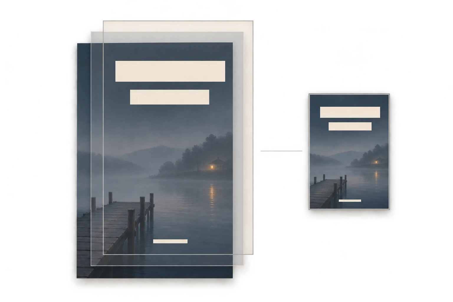
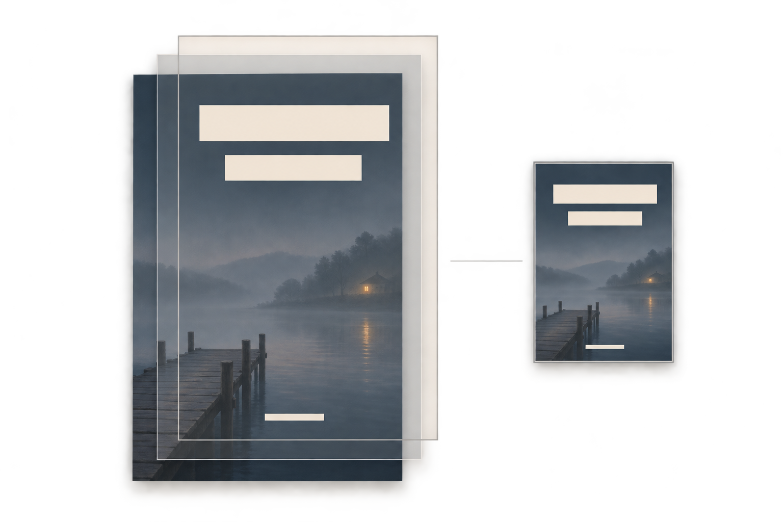
An atmospheric illustration is not necessarily a readable book cover. When using an ai book cover generator, the useful question is not just whether the image looks good. Can a reader recognize the kind of book, find the title, and understand what to look at first?
Treat the generated image as cover concept art, not a finished publishing file. FreePainter’s book-cover guidance likewise recommends creating artwork first and adding exact text in a layout editor. The approach below is an editorial recommendation, not a report of tested results.
Put the reader’s expectations in the brief
Include the title, genre, intended reader, and mood, but distinguish information for the designer from objects that should appear in the image. The title determines space and hierarchy; it does not have to become generated lettering. A synopsis helps identify a visual idea; it is not a list of everything to illustrate.
Consider a fictional exercise: The Last Ferry, an adult mystery built around a familiar place becoming untrustworthy. Rather than depicting the entire cast and every clue, the brief could focus on an empty ferry landing and one unsettling detail:
> Create a portrait-oriented front-cover concept for the fictional adult mystery The Last Ferry. Show an empty ferry landing at dusk, with a single illuminated waiting-room lamp as the focal point. Keep the mood restrained and uneasy, without violence. Leave a low-detail dark area above for a two-line title and space below for the author’s name. Do not render text. This is front-cover artwork, not a print wrap with a spine.
Text-safe space need not be featureless. It needs to avoid bright accents, busy textures, and strong edges that compete with the eventual lettering. Keep the exact title in the brief and layout file rather than relying on characters inside the generated image.
Test the concept with the actual title
Before polishing an image, place it in a layout editor and add the real title, author name, and intended line breaks. A temporary typeface can help test the composition, but it is not automatically licensed for publication.
To create new artwork from that brief, you can use InkRoom’s image-generation entry to enter a prompt and select a configured model. Availability, settings, and fees depend on the current interface and account configuration. This is an image-creation entry, not a promise of exact typography or publication-file production.
Diagnose the collision before choosing a revision. If the title hides the only important clue, change the composition. If texture competes with the letters, reconsider the text area or layout. If a long title feels cramped, test line breaks and hierarchy. Not every layout problem needs another generated image.
Review the cover at the sizes readers will encounter
Use the same working layout to assess these relationships:
| Element | Suggested review | What it does not prove |
|---|---|---|
| Title and author | Compare every character, punctuation mark, subtitle, and credit against approved copy | Letter-like shapes are not accurate text |
| Hierarchy | Check whether the title is easy to locate and secondary text has a distinct role | Making everything larger does not create hierarchy |
| Thumbnail | Preview at the intended channel’s actual display size, then inspect the full-size layout | A readable large image may fail when reduced |
| Series identity | Compare title areas, author placement, and recurring identifiers side by side | A shared identity does not require identical artwork |
There is no single thumbnail size specified here: store listings, mobile pages, and promotional placements differ. Record the display size used for your review. For a series, consider fixing the lettering zones and recurring identifiers while allowing each volume its own subject. That is a design method, not a guarantee that a model will preserve consistency.
Separate a finished front cover from a publishing file
Obtain dimensions from the actual distributor or printer rather than inferring them from a sample image. An ebook front cover and a paperback wrap containing the back, spine, and front are different deliverables. For print, obtain the applicable template and confirm trim, bleed, safe areas, and spine requirements before checking pixel dimensions, resolution, and export format. No universal production measurements are assumed here.
Permissions also need separate review: the generation service and selected model’s applicable terms, rights to uploaded references, font licensing, and any relevant likenesses, trademarks, or other third-party material. Keeping the terms version and review date supports later checks; it is not a legal determination.
“Free,” “downloadable,” and “watermark-free” do not establish commercial permission. The FreePainter page used as a reference says its service is intended for personal and experimental use and does not grant a commercial license. That statement belongs to that service, not InkRoom or other tools. The supplied source has no content-update date, so verify applicable terms again before use.
A useful handoff makes the boundaries visible: image assets, exact editable text, confirmed production requirements, and unresolved permissions. Generated artwork supplies the visual layer—not all four.
Related articles and cases
- gpt image 2.6 gif: a product-loop brief and unresolved API details
Plan a small product animation and inspect its loop, identity, lettering, and dimensions. Official API routes and animation limits remain unverified in the supplied evidence, so this draft does not offer executable requests or unsupported parameter values.
- AI Poster Generator: Turn an Event Brief into a Publishable Layout
Use a hypothetical event to plan the title, date, colors, dimensions, and text space—then separate visual generation from proofreading and layout for each placement.
- AI Makeup Generator: Try the Makeup, Not a Different Face
Preview lip color, eye makeup, and blush on your own photo without confusing a flattering face edit with a useful makeup idea. Includes natural and stage-makeup briefs plus practical checks against the original.
- AI Image Style Transfer: Change the Look, Keep the Details
Separate content references from style references, then handle color, brushwork, and composition as distinct choices. Use two editing rounds to check identity, product shape, text, and logos.